

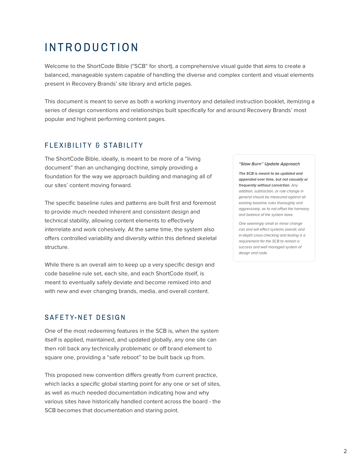
“The ShortCode Bible”
A Comprehensive UI System for Multiple Websites
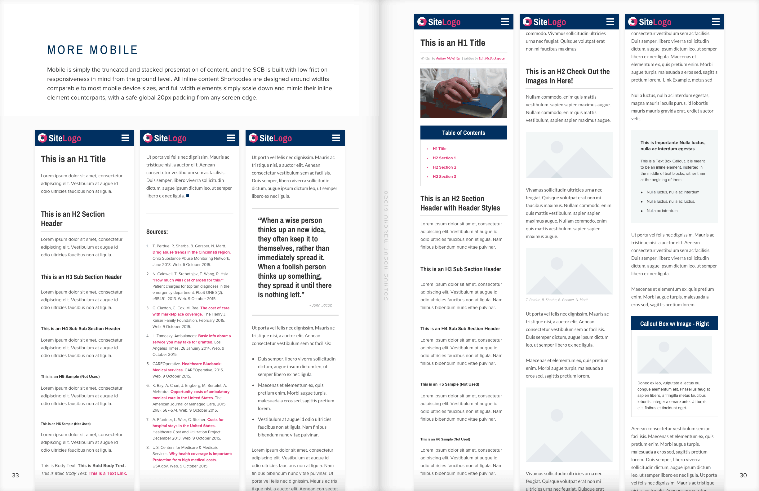
The task: to create a fully customized, flexible, and scalable UI design system that can support the content of up to 20 different websites.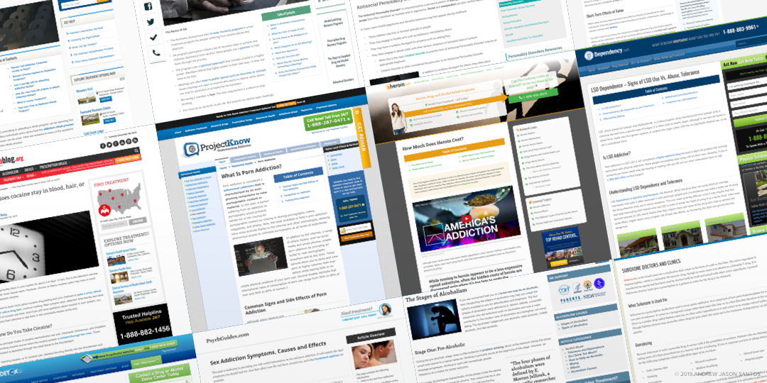
Overview
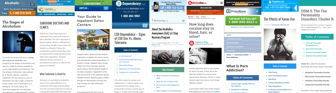
When you have up to 20 different websites to manage and add an ongoing stream of topical informational content onto, it can seem like an impossible task, without some sort of underlying system that governs how they all operate and work together. In this case, that underlying system was exactly what was lacking, as each website had been built and designed completely differently, some sites acquired from 3rd party companies, others built by teams that were no longer around, all with unique quirks, bugs, and issues that were in desperate need of some tender love and design care.
Tasks and Challenges
Identify the most valuable and necessary content design elements on numerous independently built and structured web properties
Streamline and refine these elements into one elegant, working visual system
Build heavy but controlled variability to UI/UX systems for brand purposes
Work across Content, Design, Development, and Leadership teams
Lead the entire process, through Research, Planning, Design, and Implementation
Research & Planning
The research involved with the project was tasked to me with little to no existing data, resources, or direction, so I took it upon myself to devise my own value and efficiency measurements, based on the general feedback and insight I could gather from various stakeholders and others involved with page and content production tied to this project.
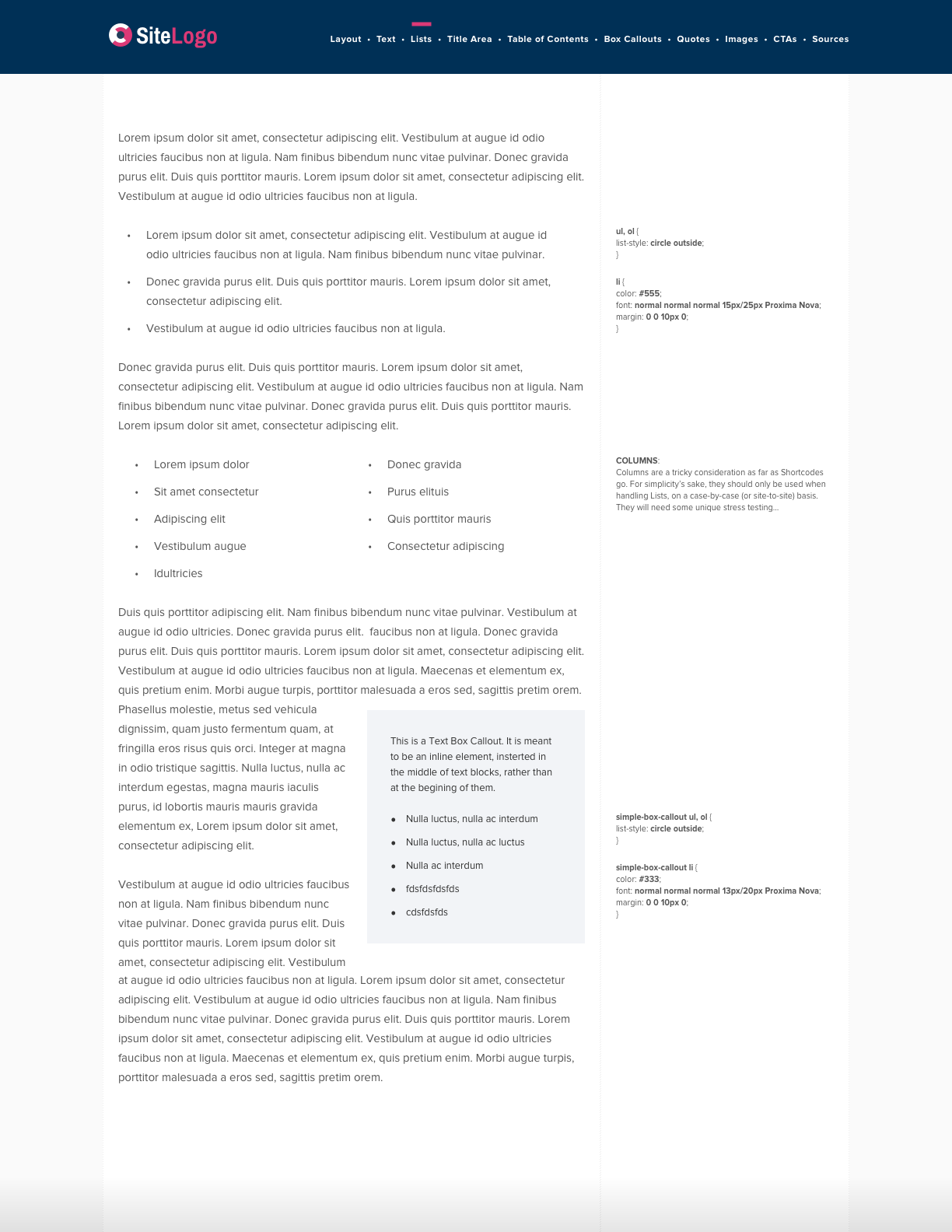
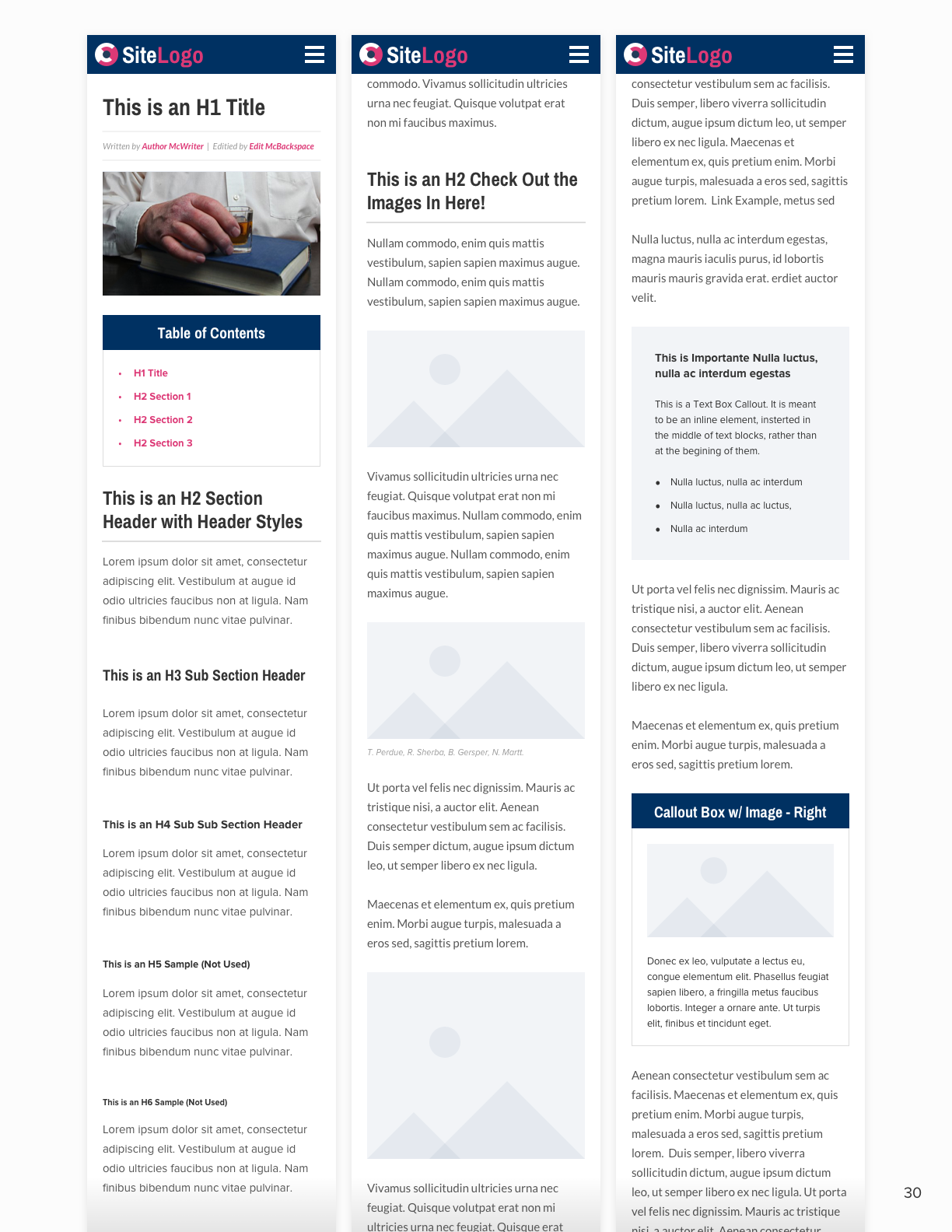
I first was able to gather then current numbers on the top 5 visited content pages over several months time, for over 15 of the potentially ShortCode Bible bound websites. Upon observing these top performing pages, I gathered notes on the most frequently used visual elements across the board, and curated a list of elements to include in the new system. I also chose to exclude more complex, less frequent visual elements that only appeared sporadically on these pages, in an effort to streamline the process in practical, valuable ways. The end list of elements included the following:
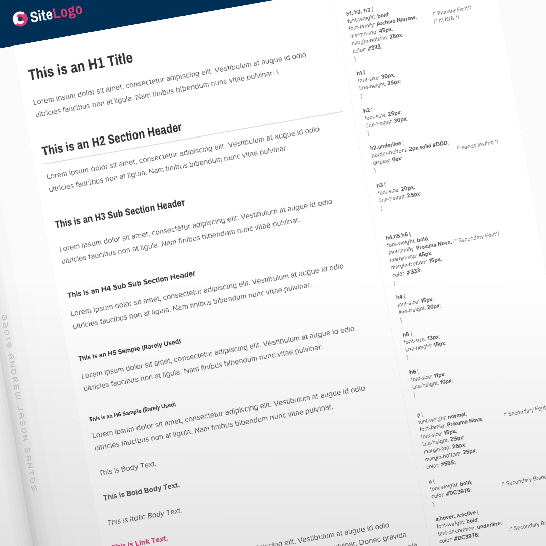
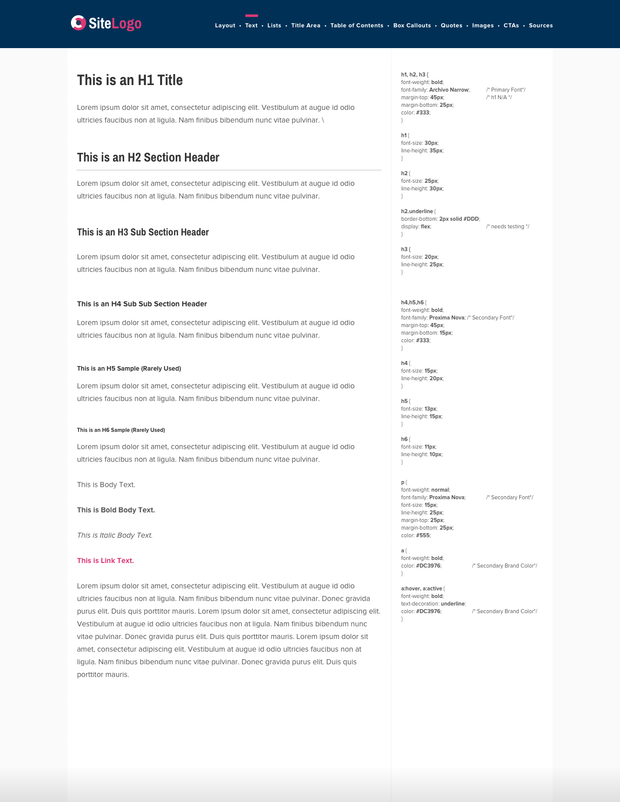
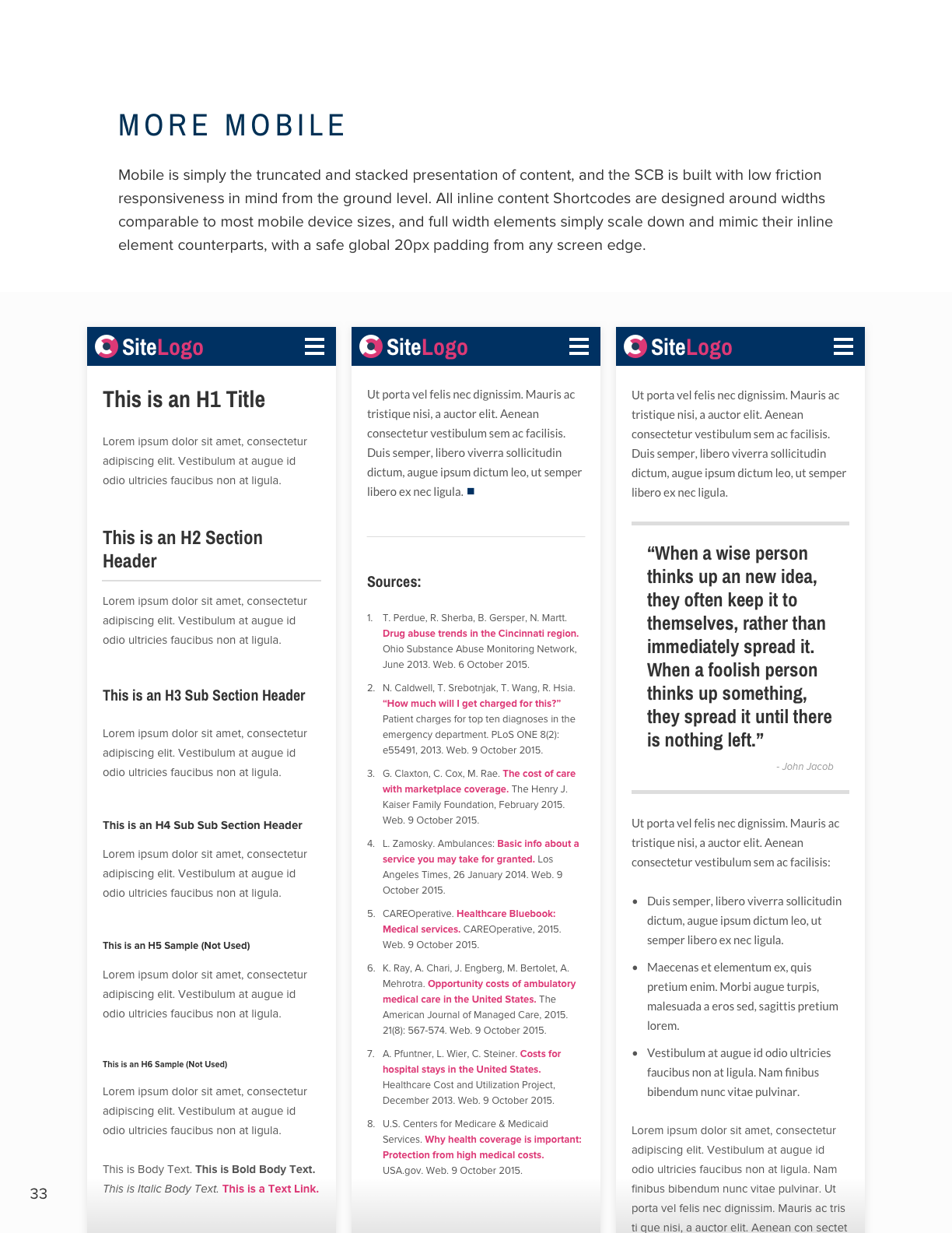
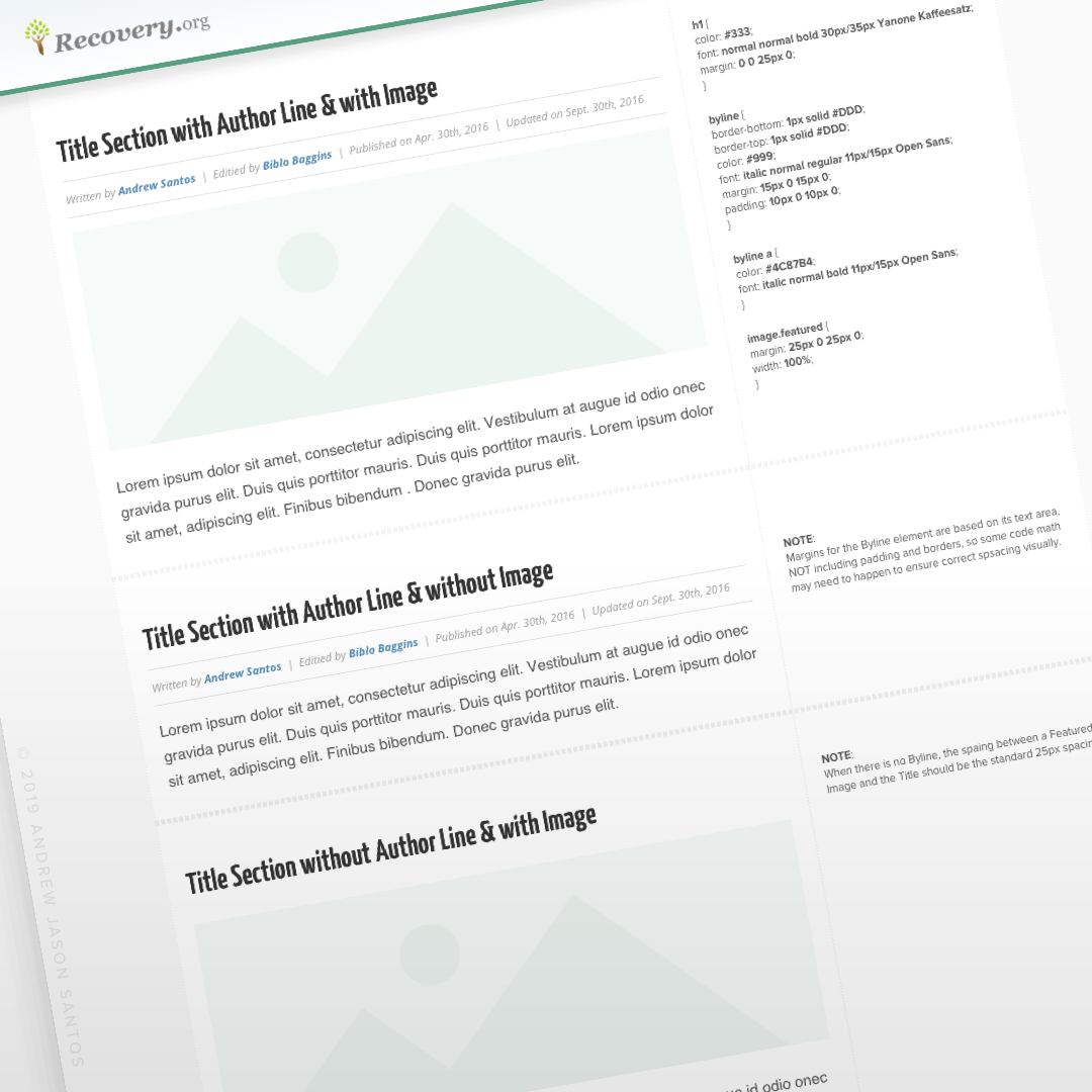
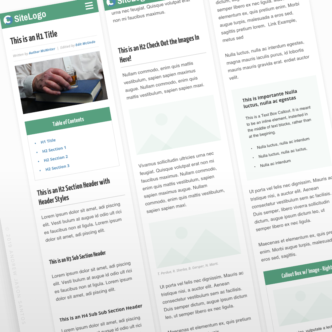
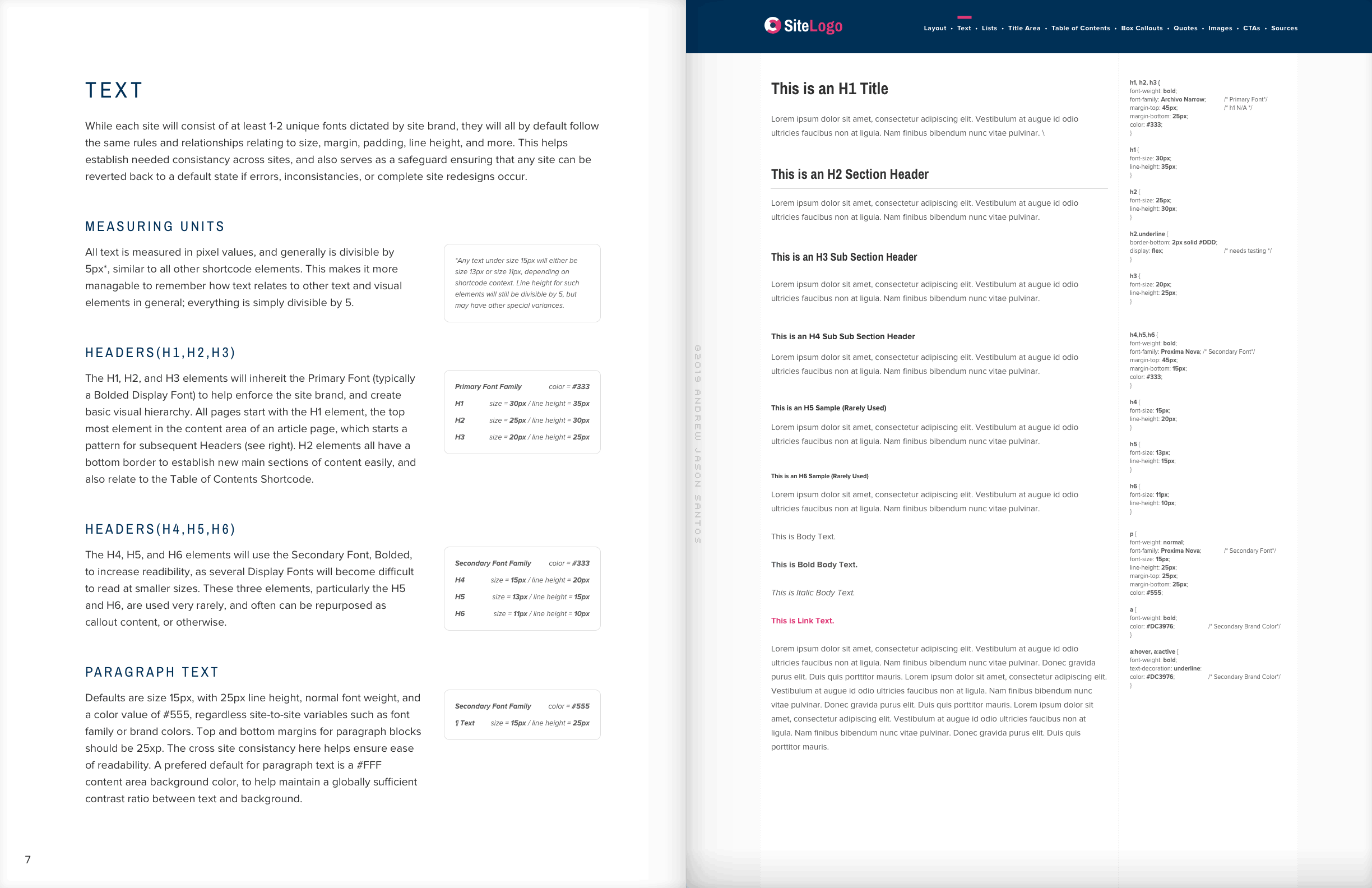
H1, H2, H3, & Body Text
Link Styling
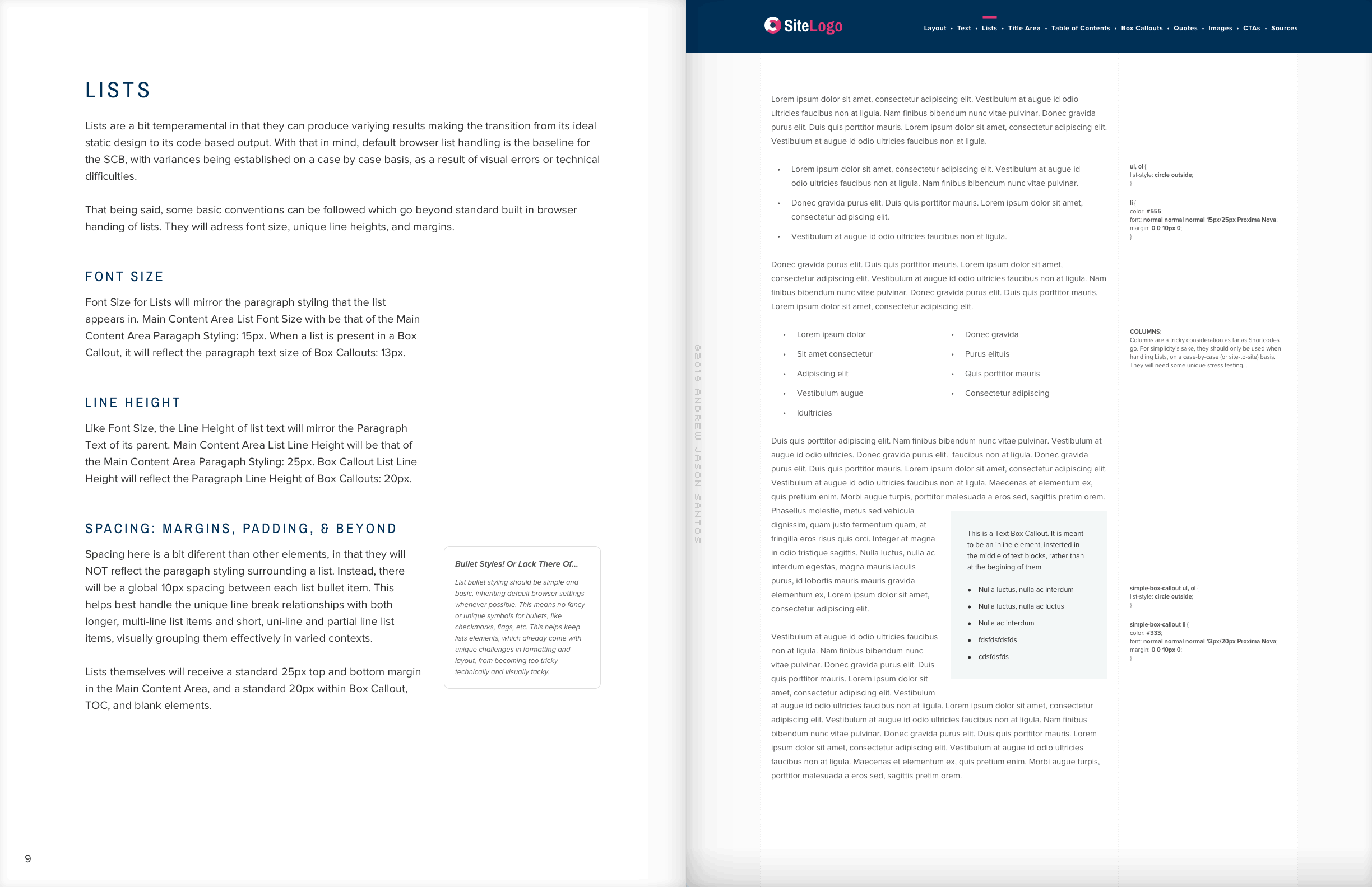
List Formatting
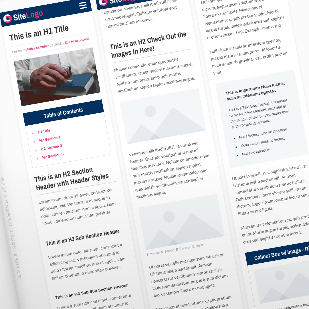
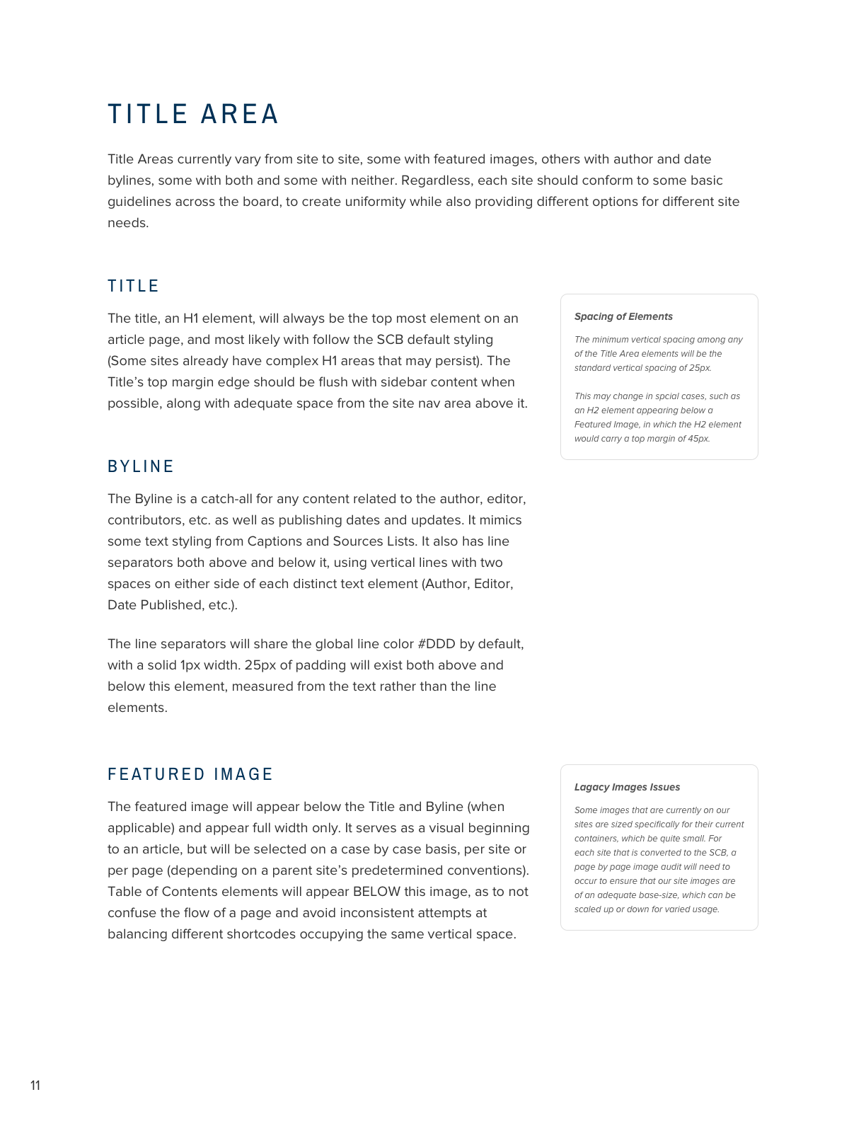
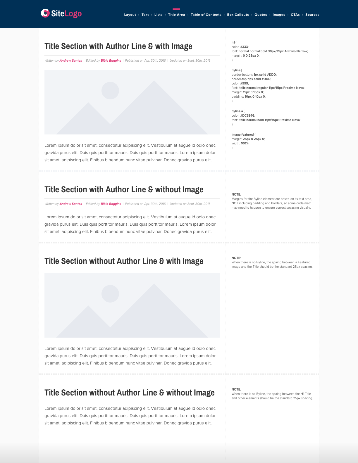
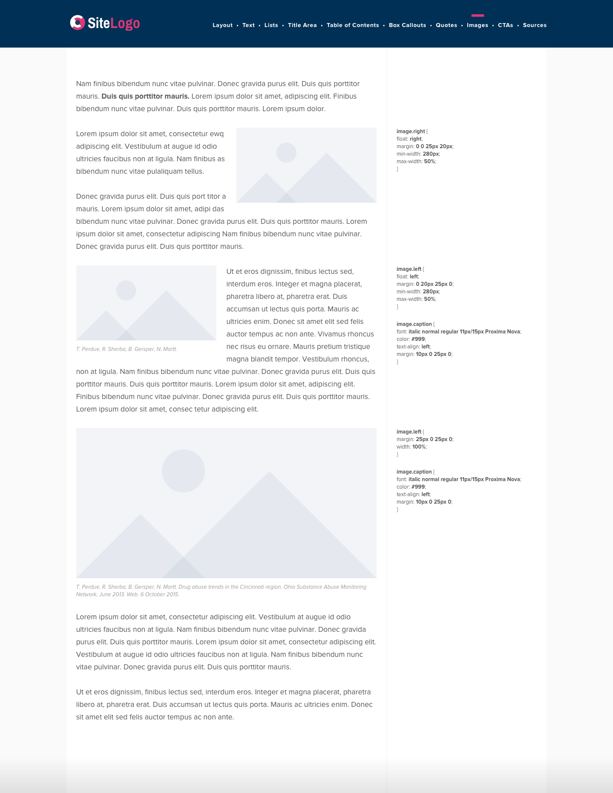
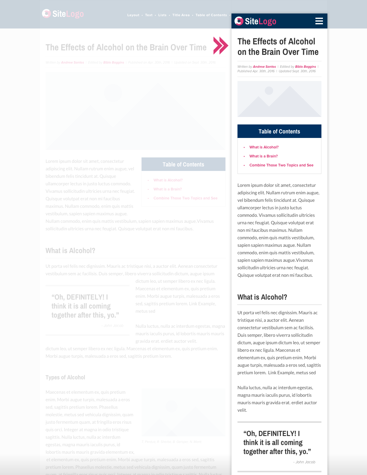
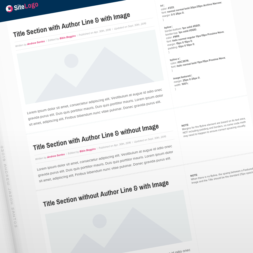
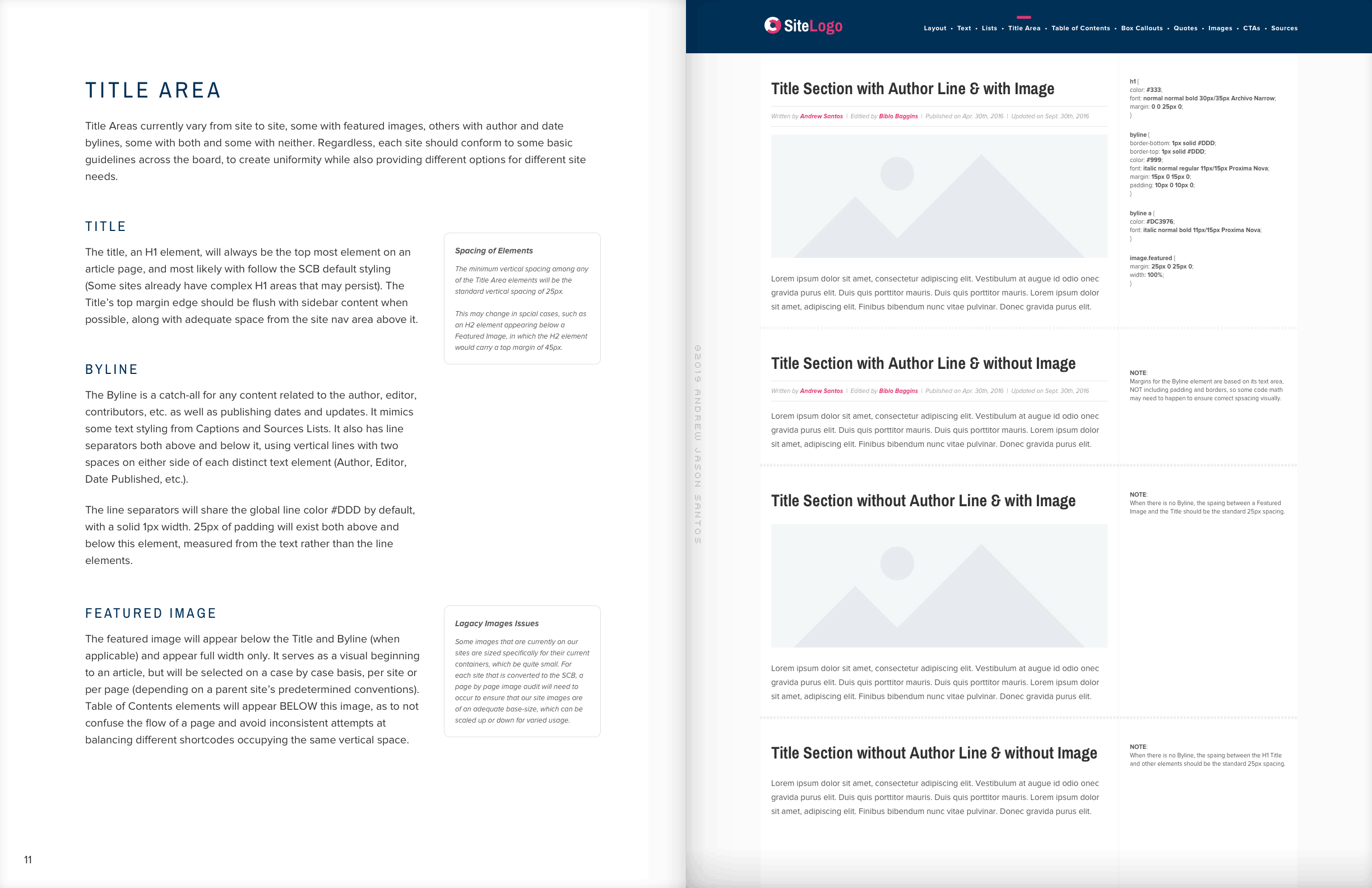
Title Image
Byline Styles
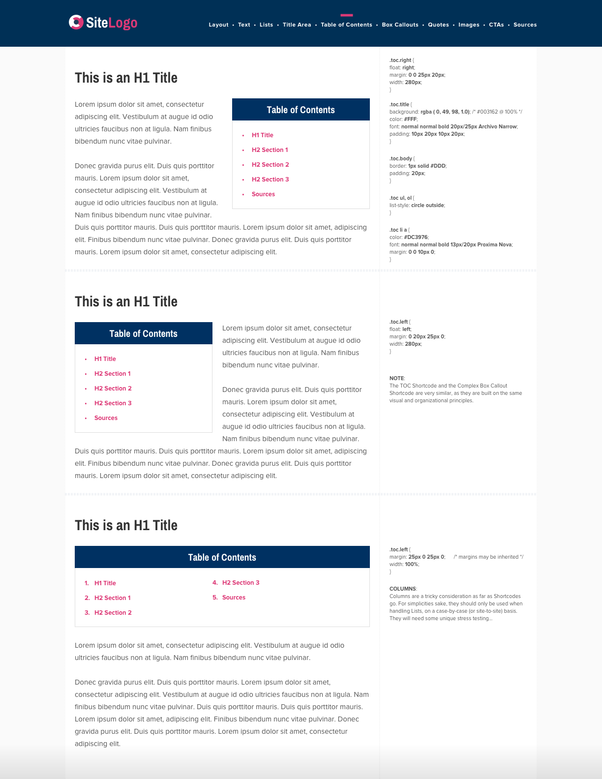
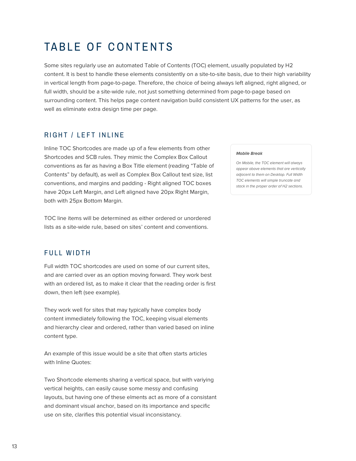
Table of Contents
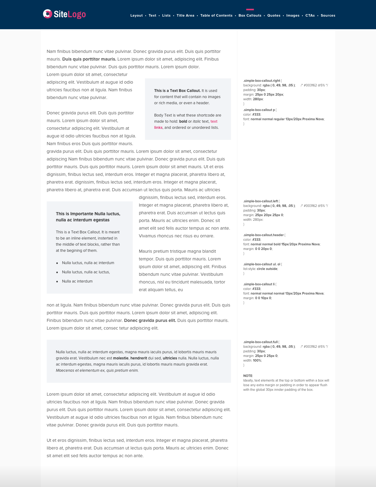
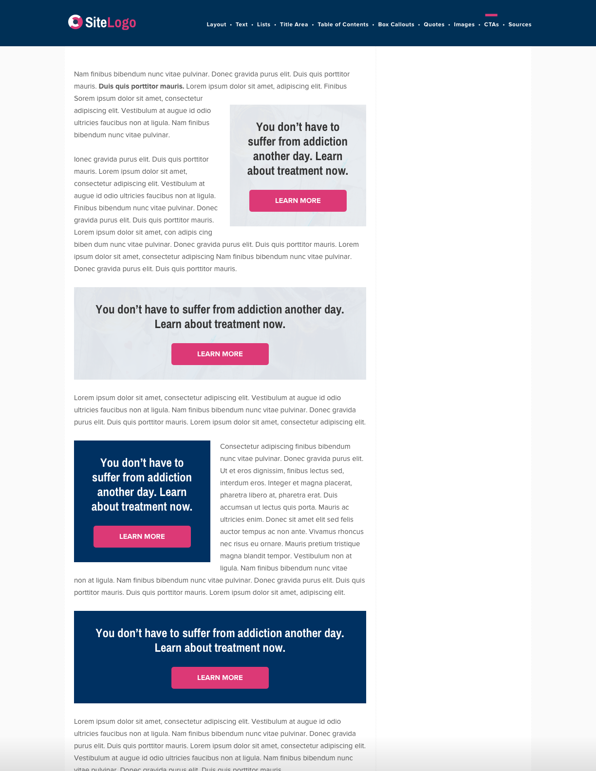
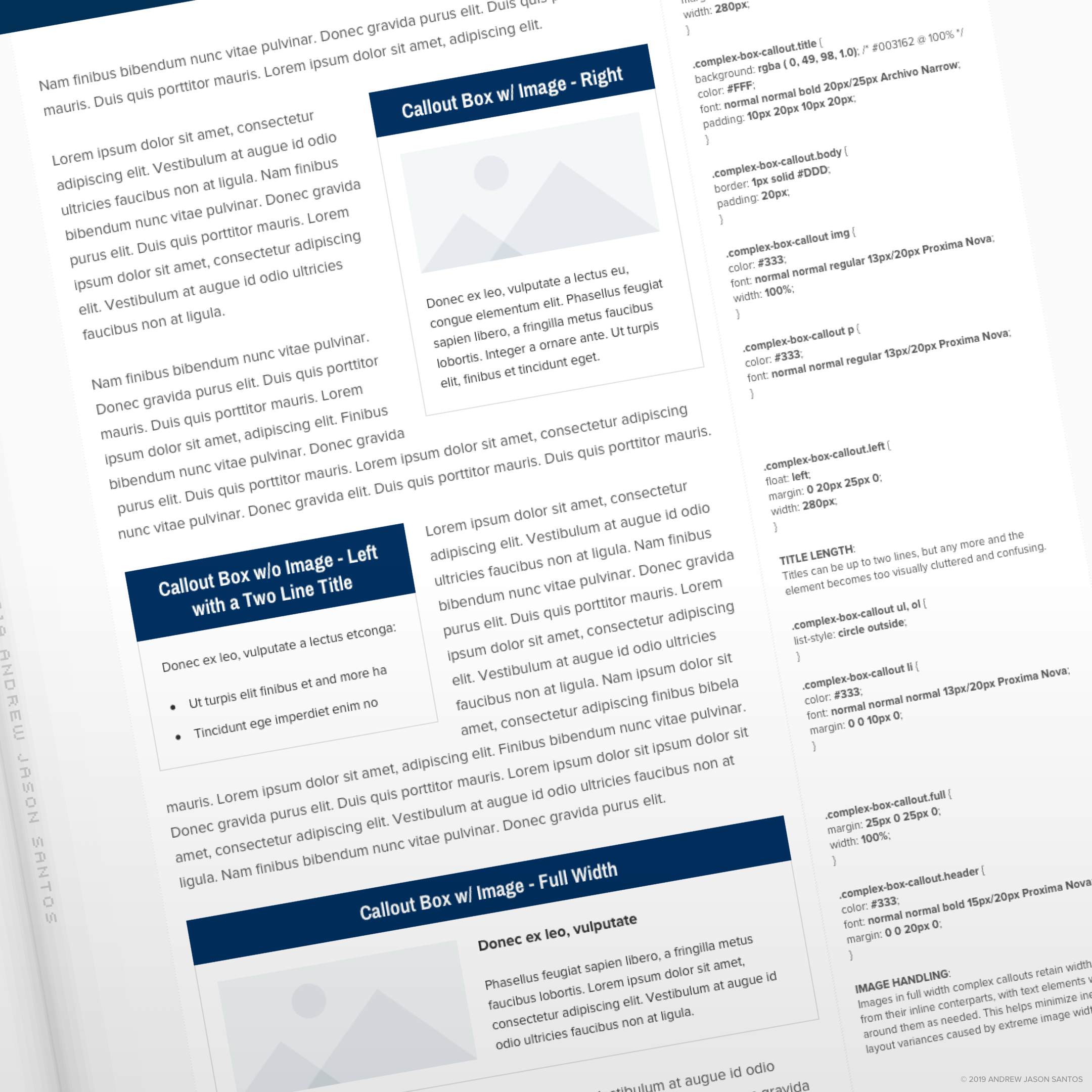
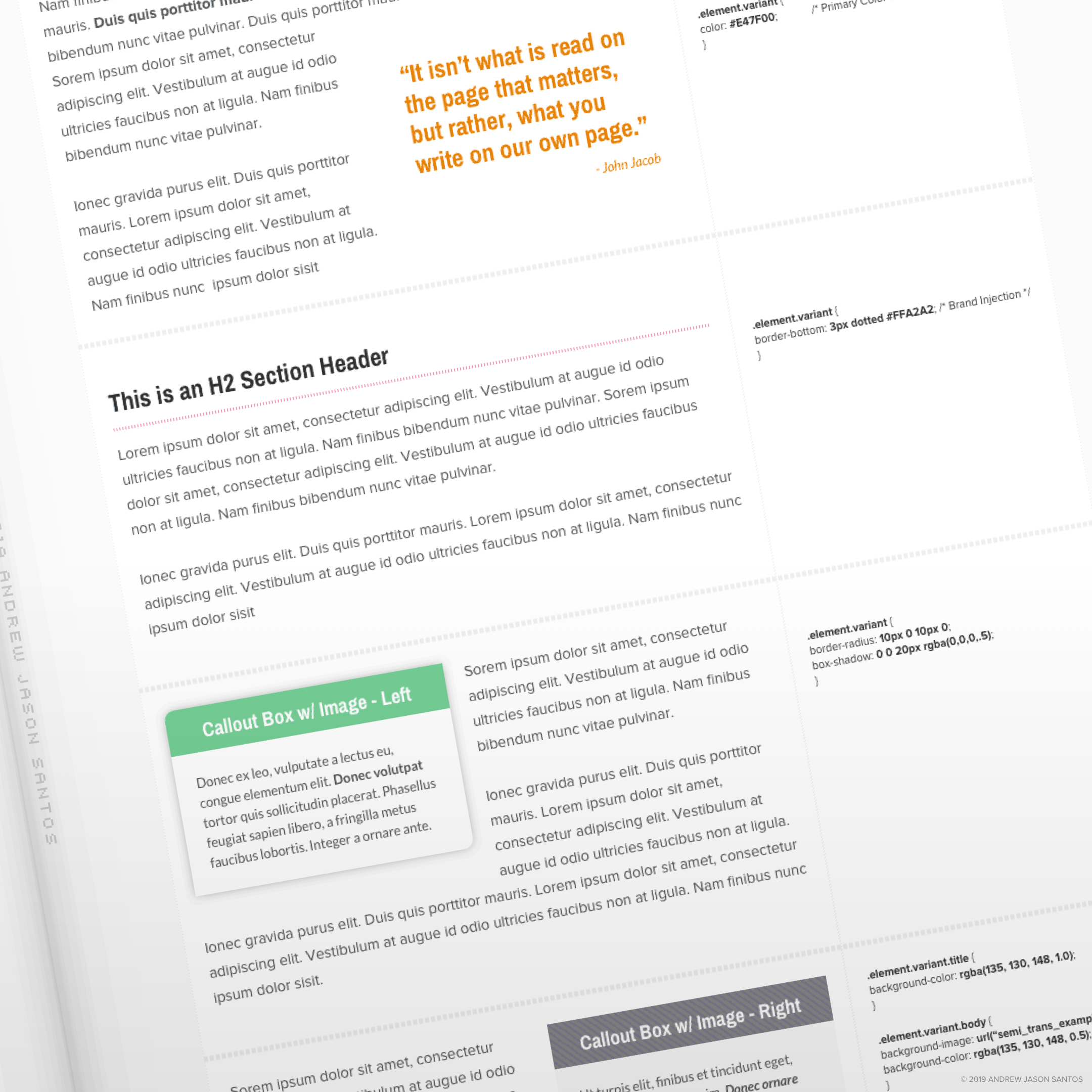
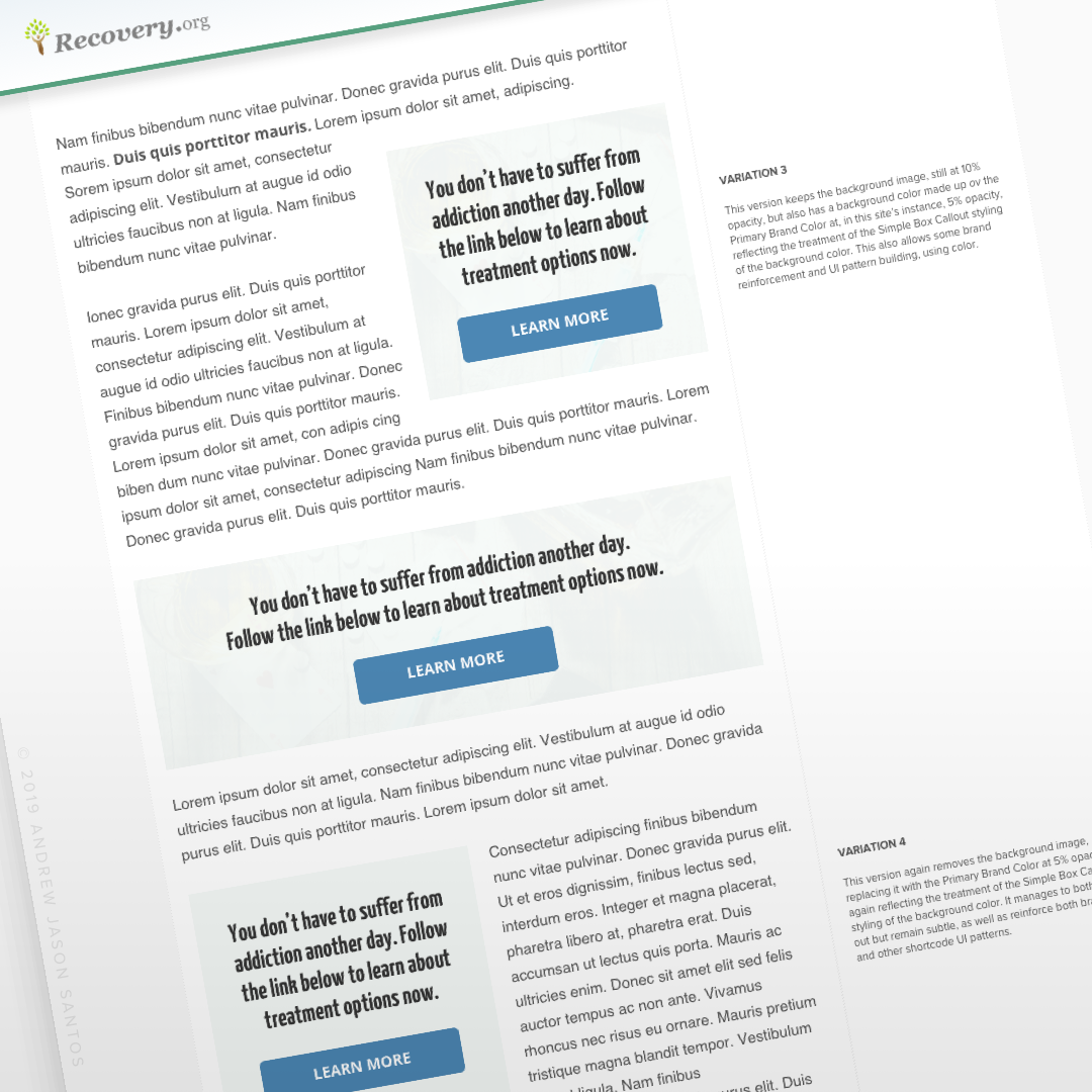
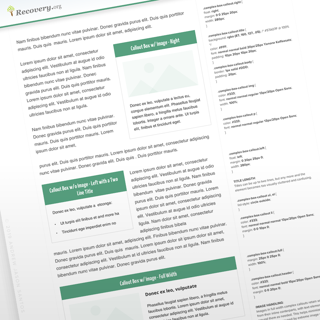
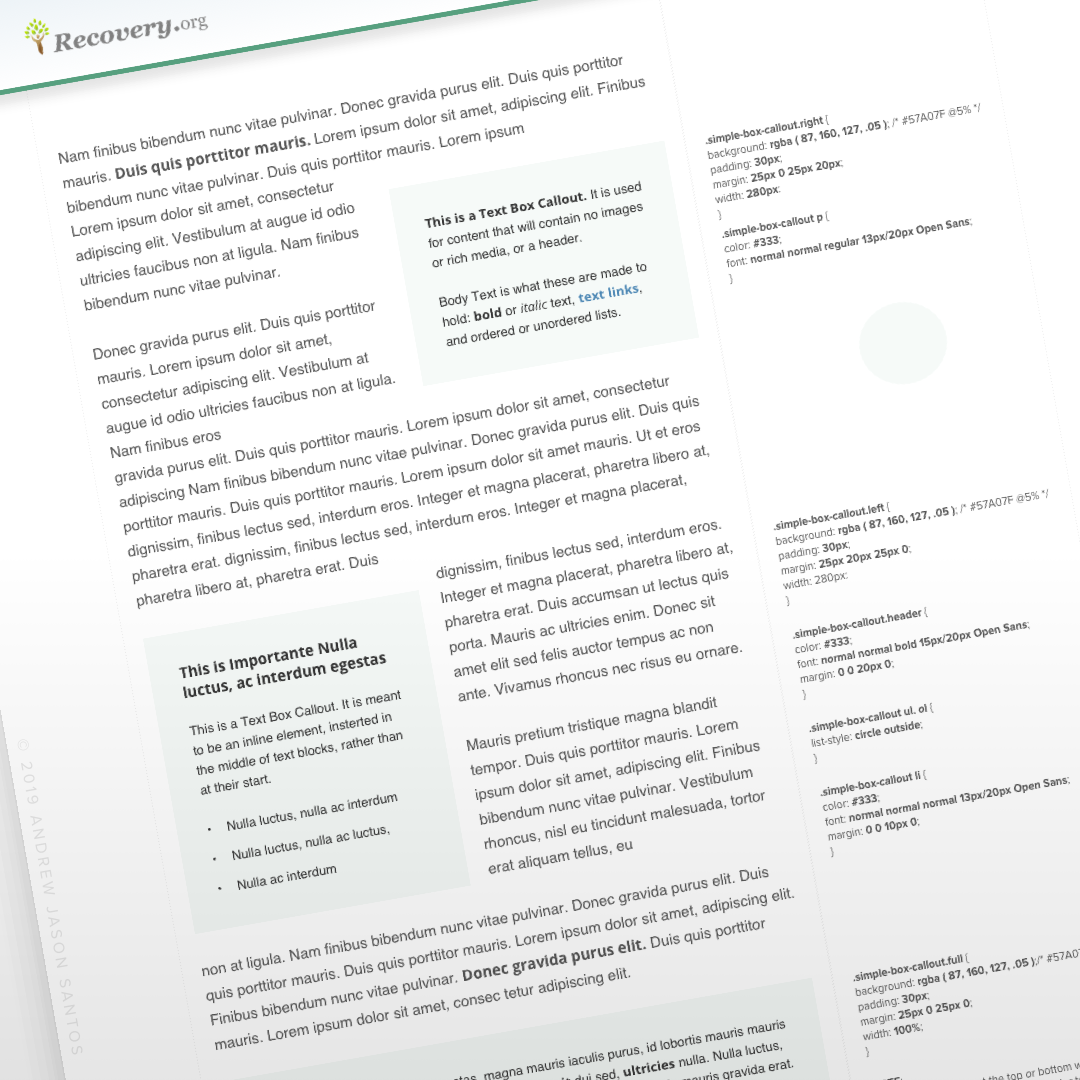
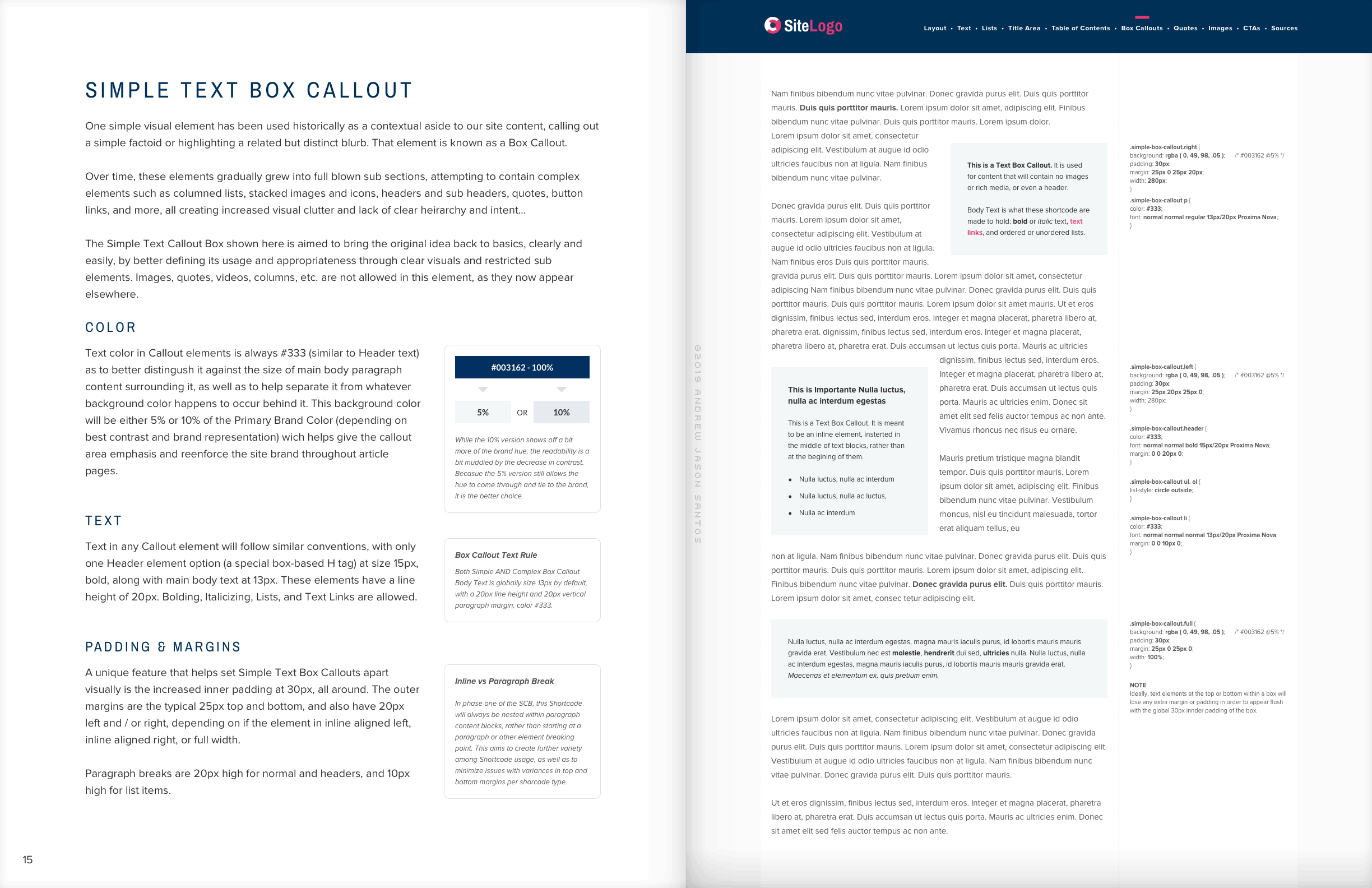
Simple Box Callouts
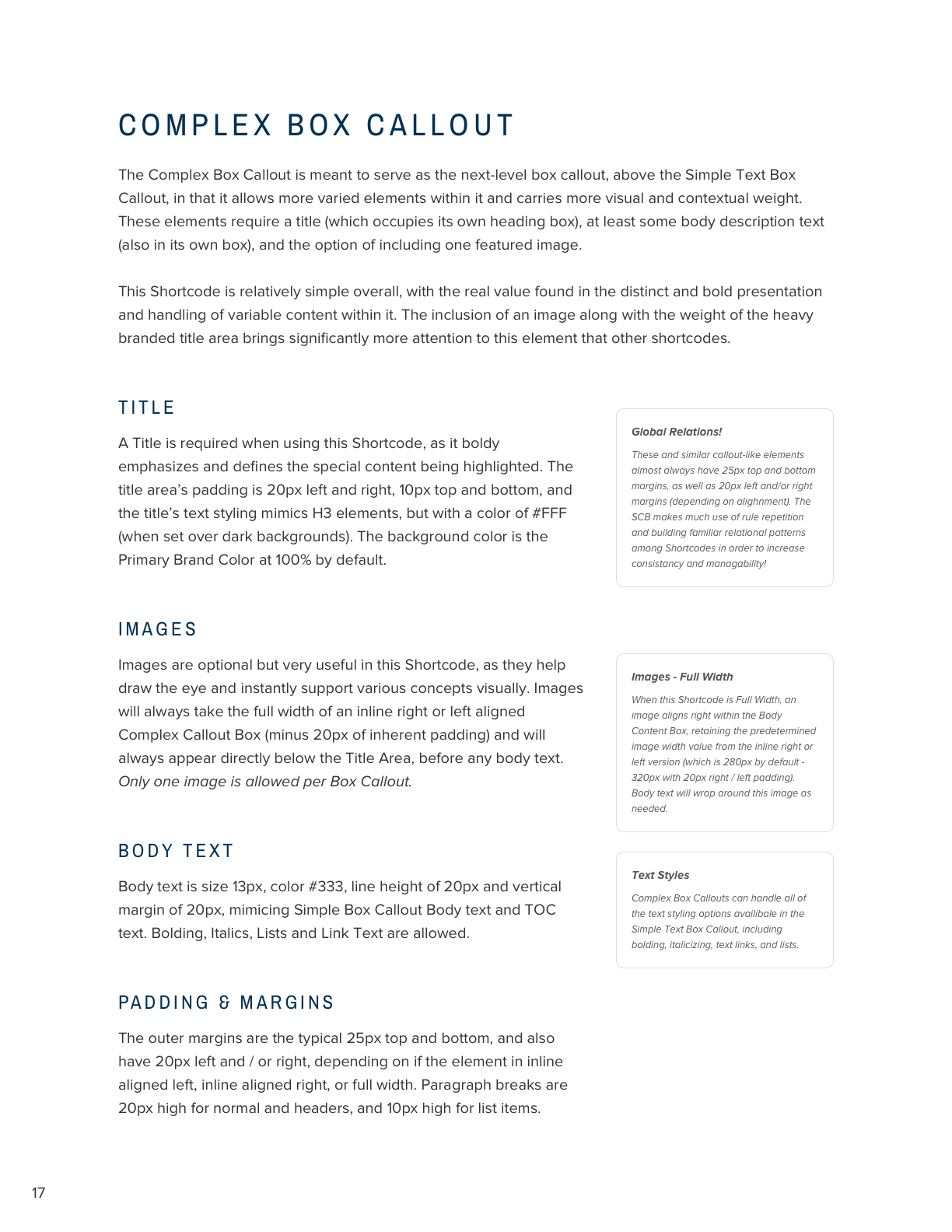
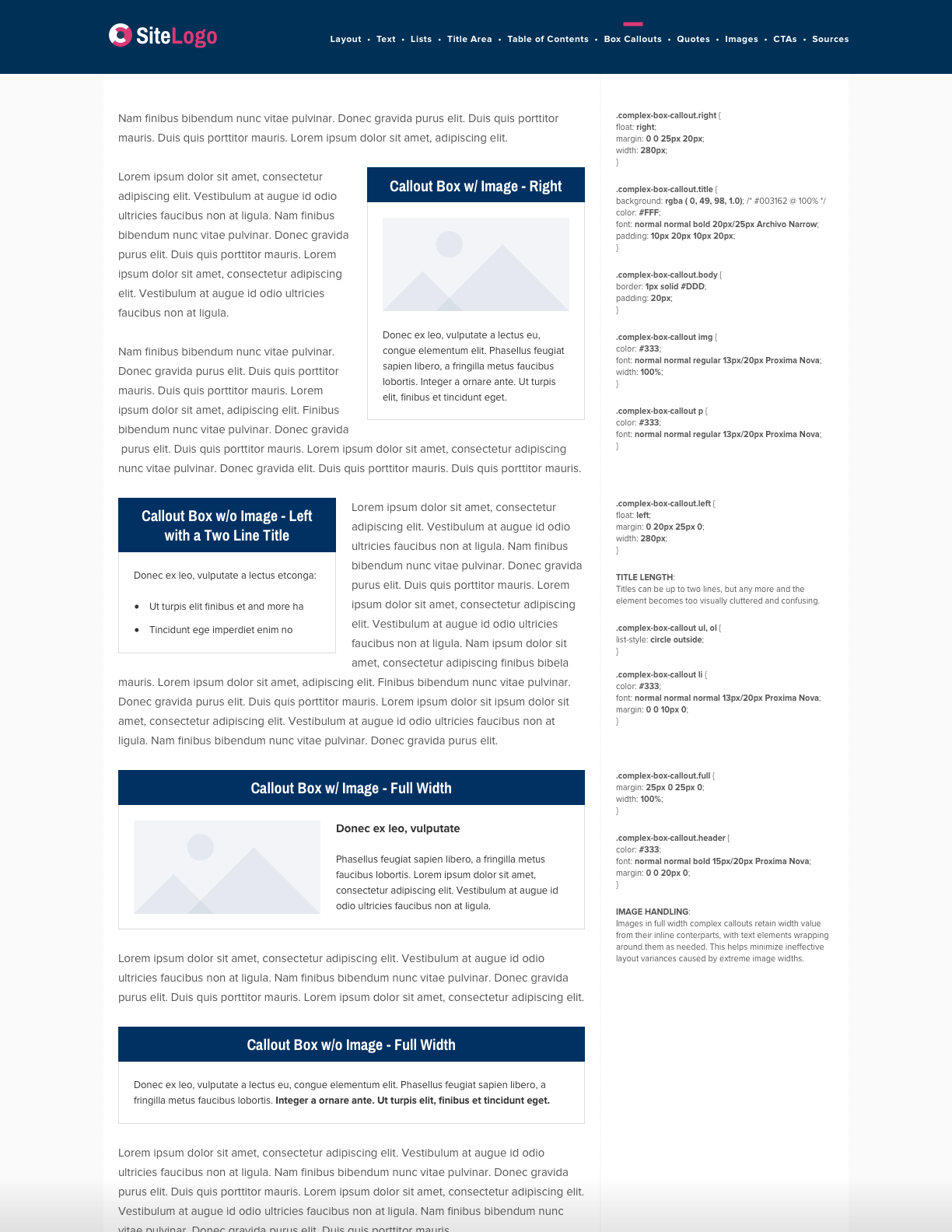
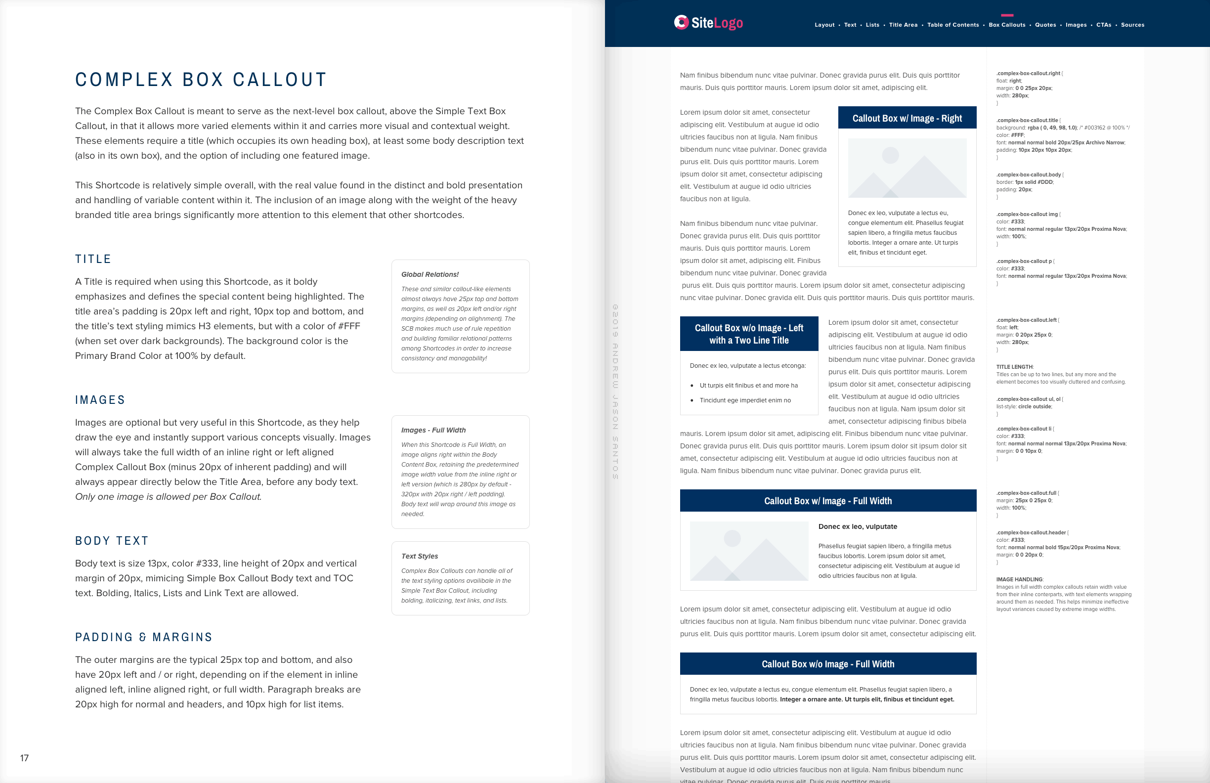
Complex Box Callouts
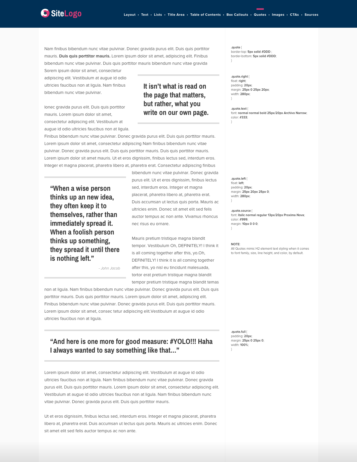
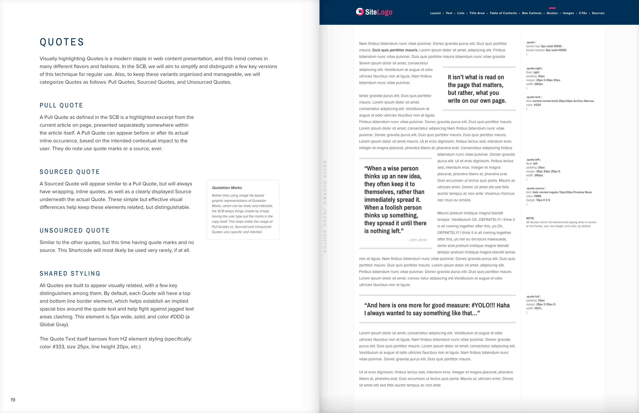
Quotes
Pull Quotes
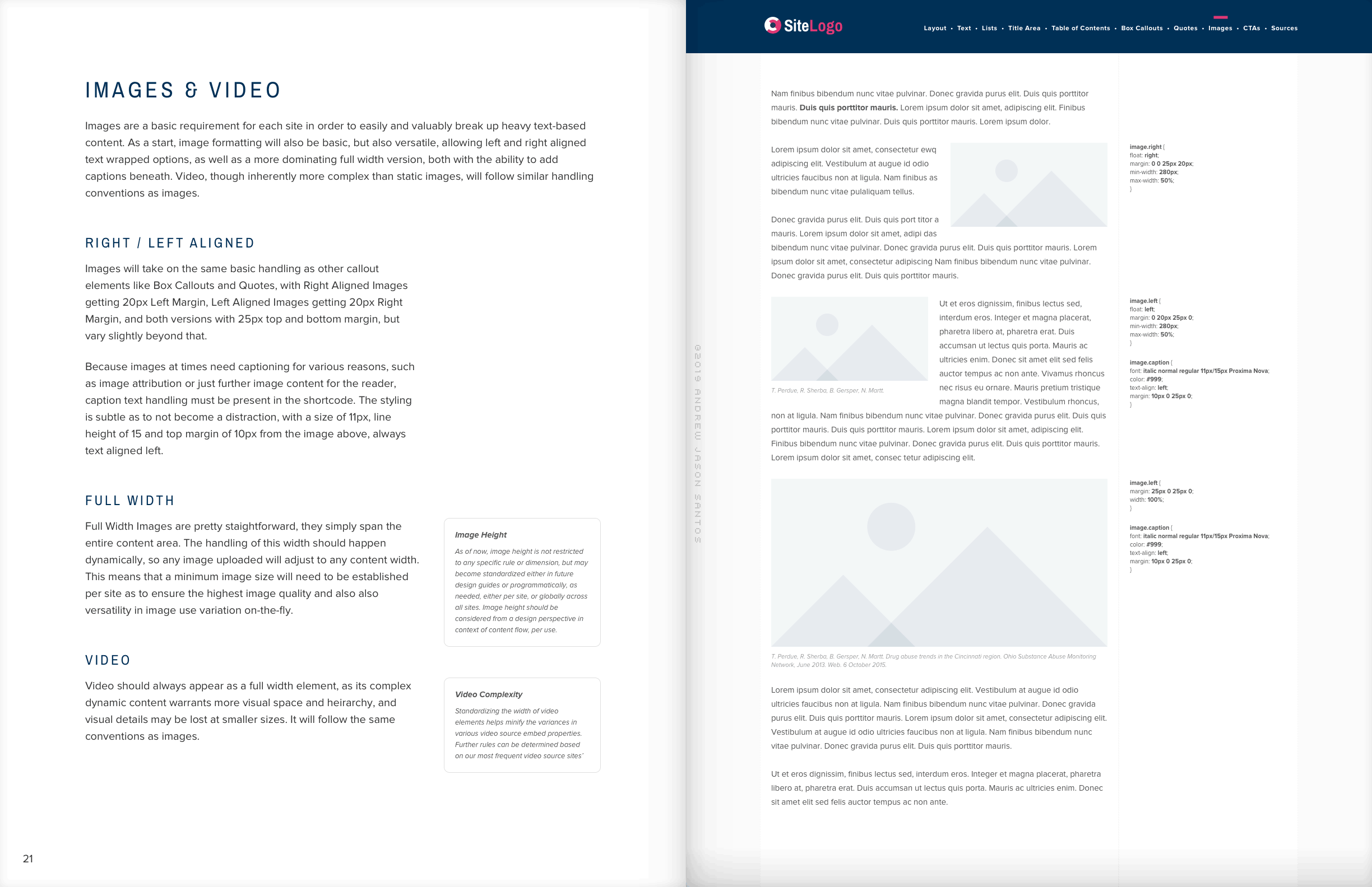
Images/Video
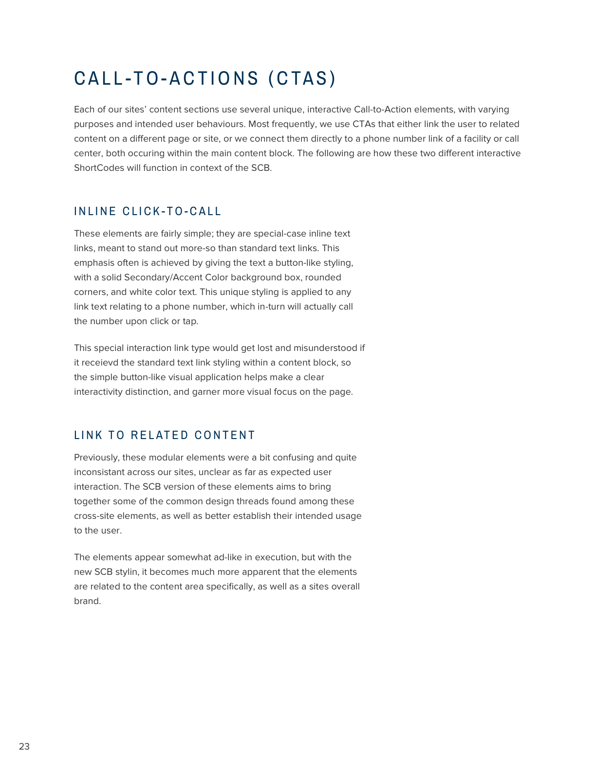
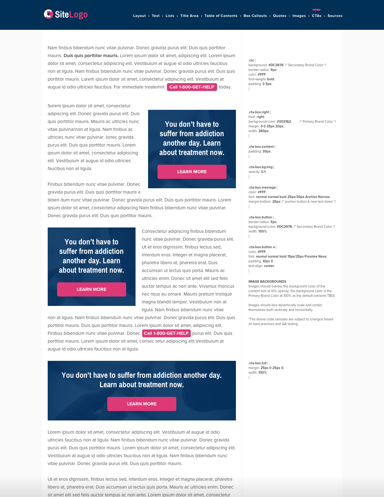
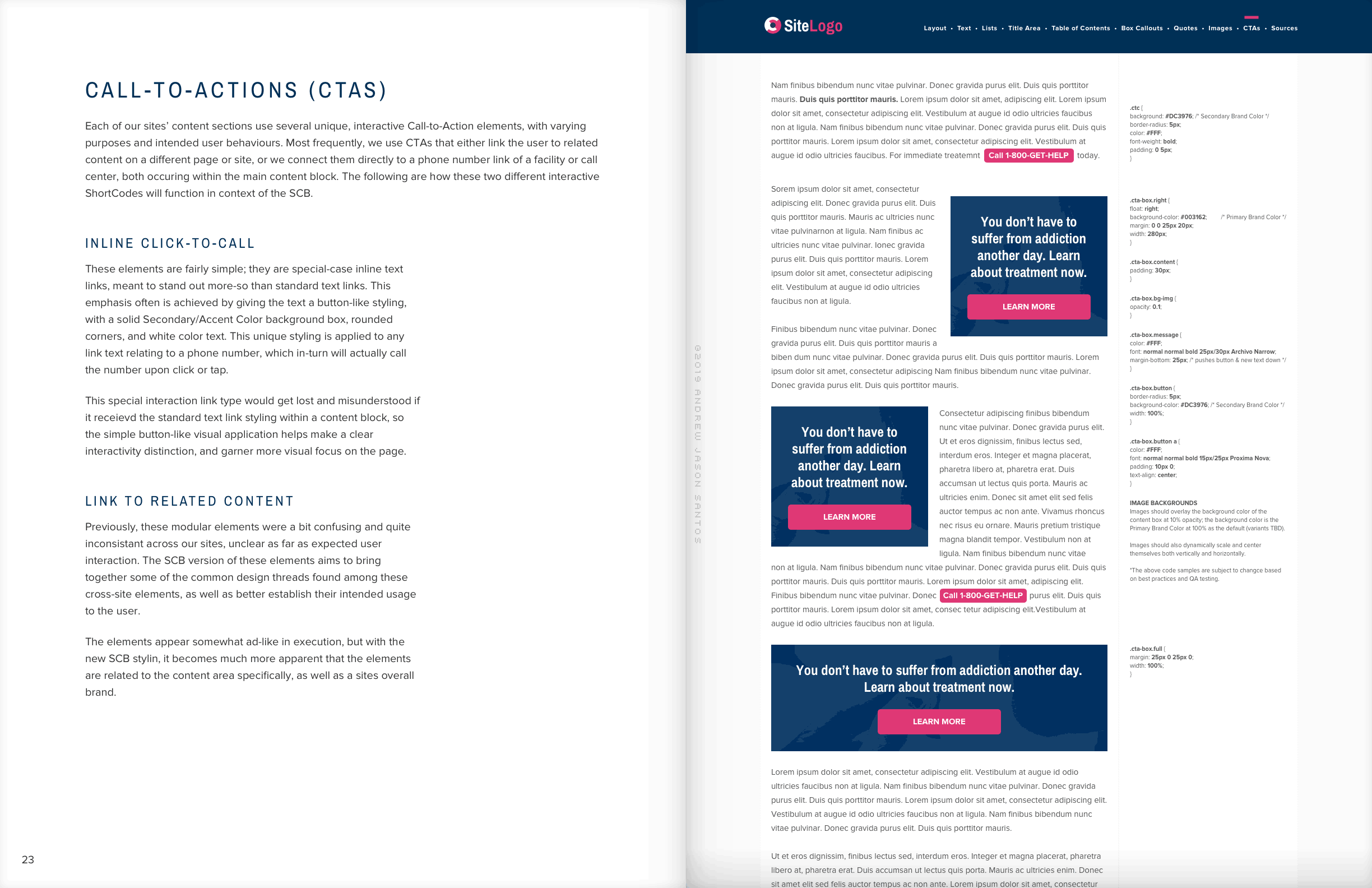
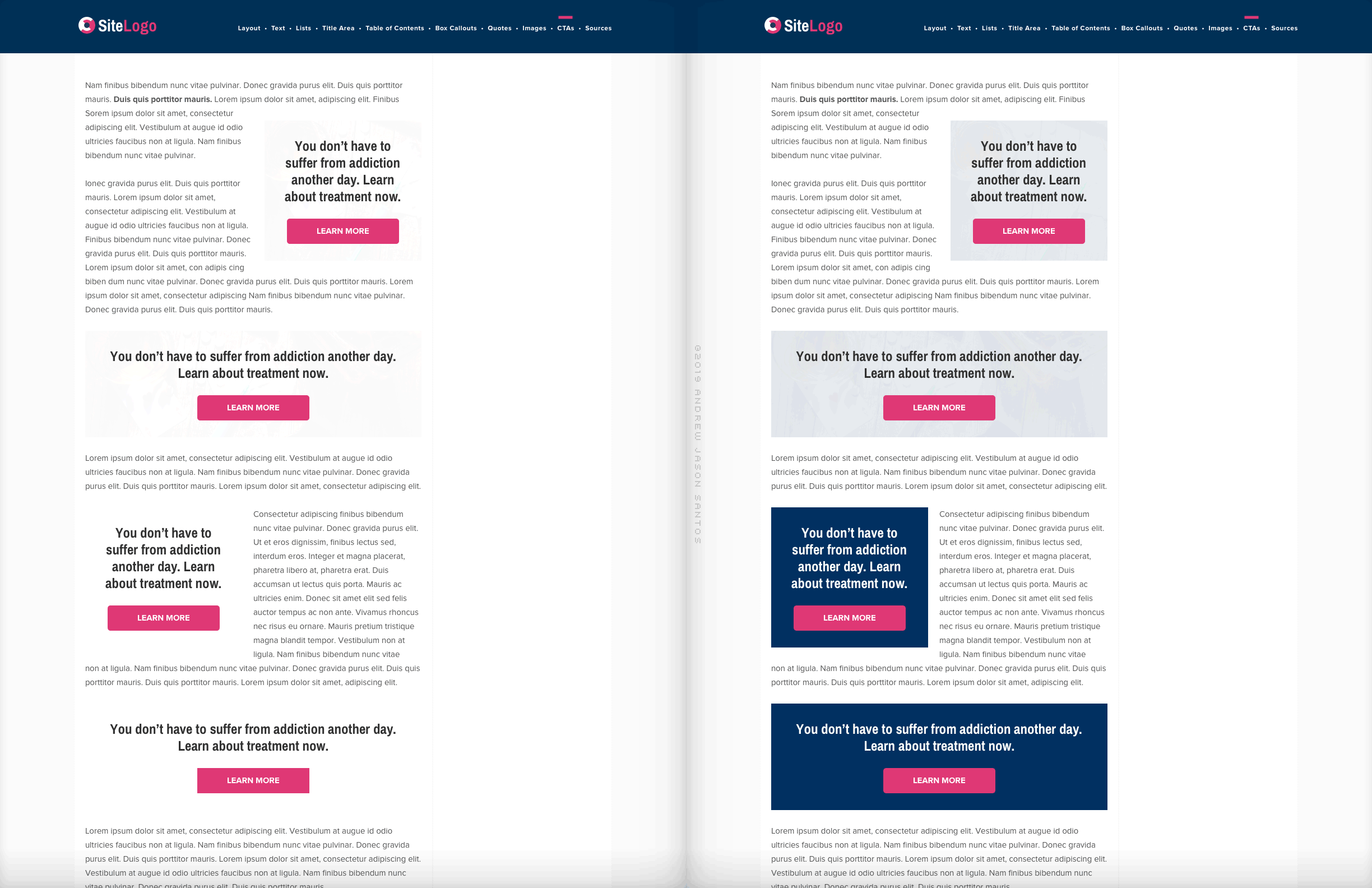
CTAs
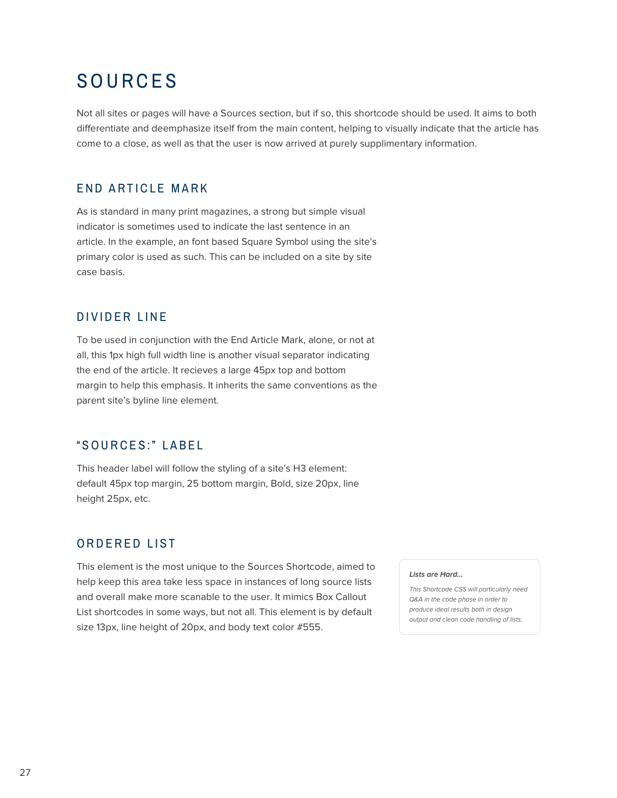
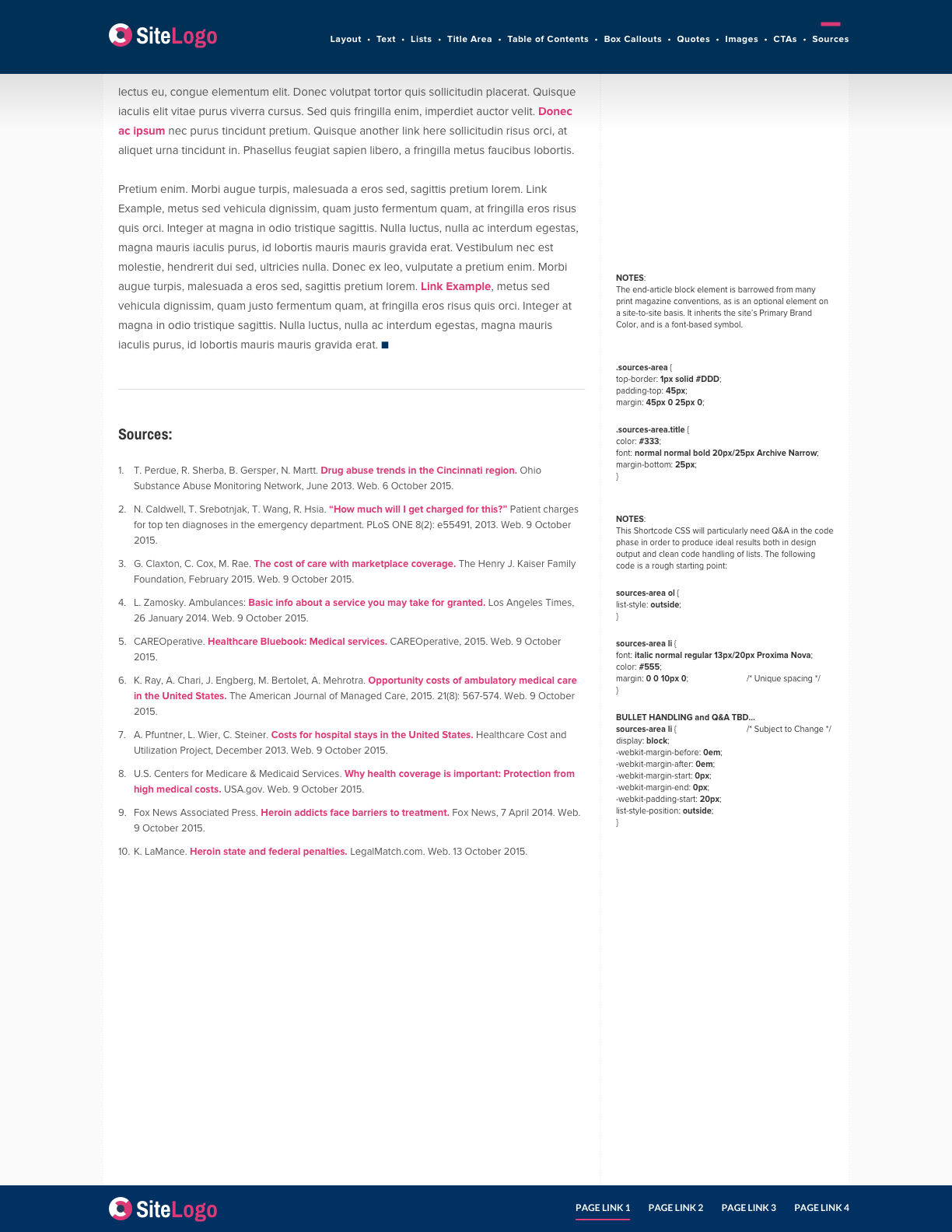
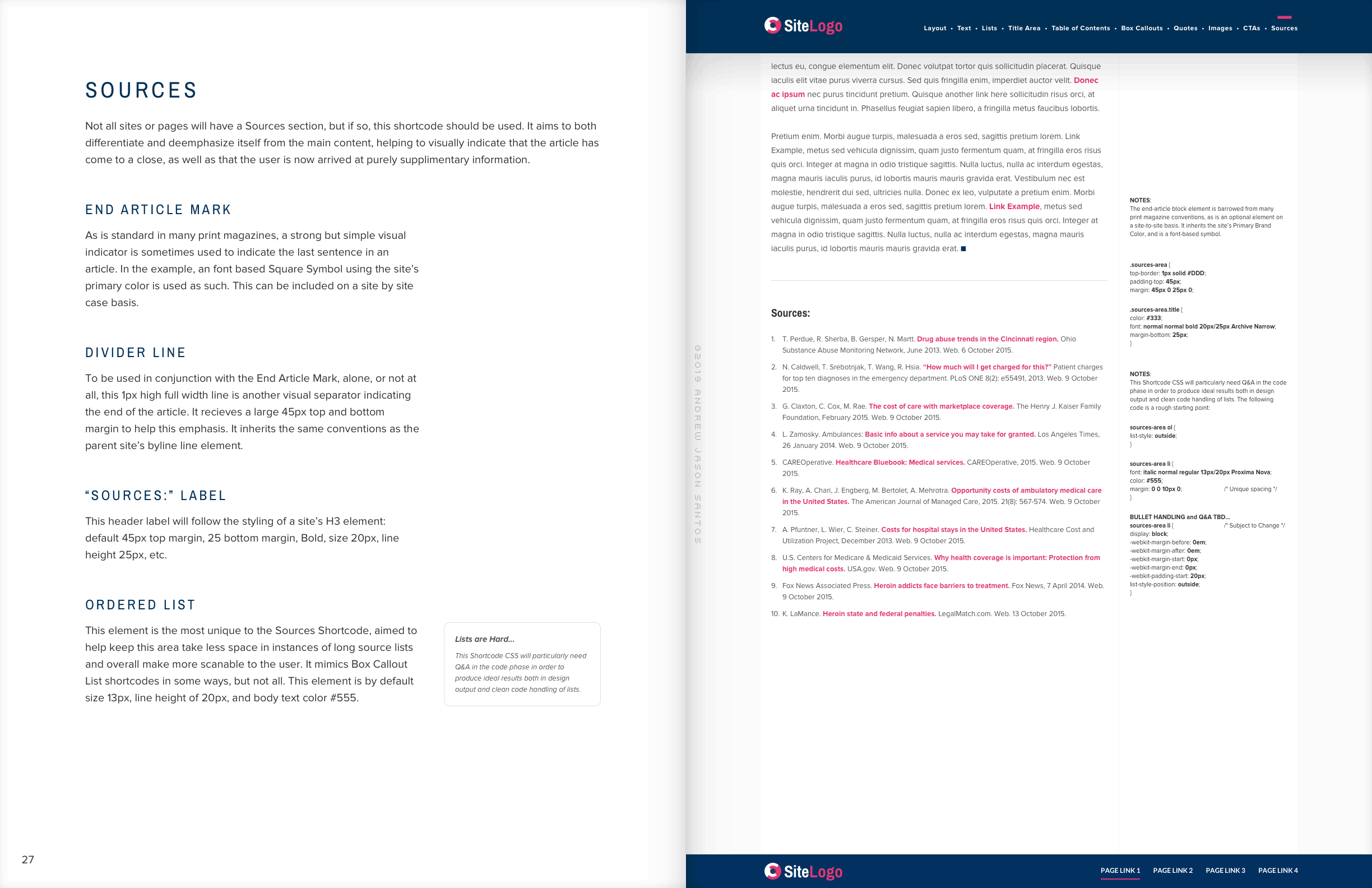
Sources
Once these key content design elements were identified and quantified by myself breaking them down into manageable, variable design parts, I was able to begin the process of creating a “white label” UI system that could be used on any site; Brand elements like color and font could be seamlessly inserted to the system, assimilating content to its host site.
“The Whole Dang Guide Itself…”


System Design
This step by far took the most iteration and nuance, as there really was no precedent to this kind of global, sweeping design consolidation in the company, and I was spearheading the operation, solo.
I devised a mixture of common UI practices with more custom and specialized solutions to best suit the unique content and code framework our content and development teams were working with. Every single website at this stage was virtually running in different ways, with variations in code and approach to design, so I had to take a very holistic yet organic and flexible approach. Where I showcased fixed or rigid values to elements in various contexts, I knew to be ready for them to potentially become fluid, and vice versa, as this was unknown territory for not only the design team, but the development team as well. I aimed to first focus on overall intent behind all design proposals, and settle on technical approach after the fact, once presented and discussed with various contributing teams and stakeholders.
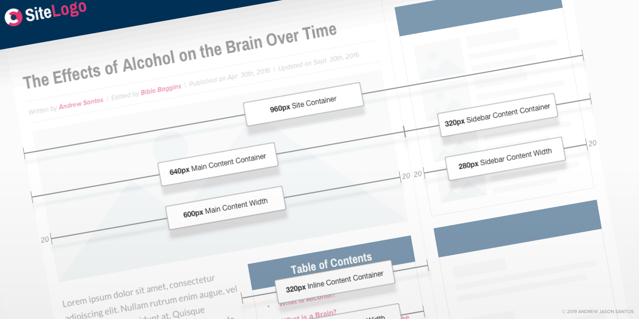
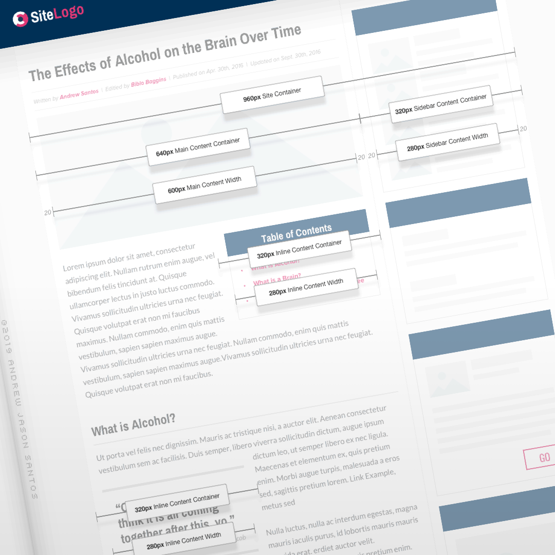
Numbers, Size, & Spacing
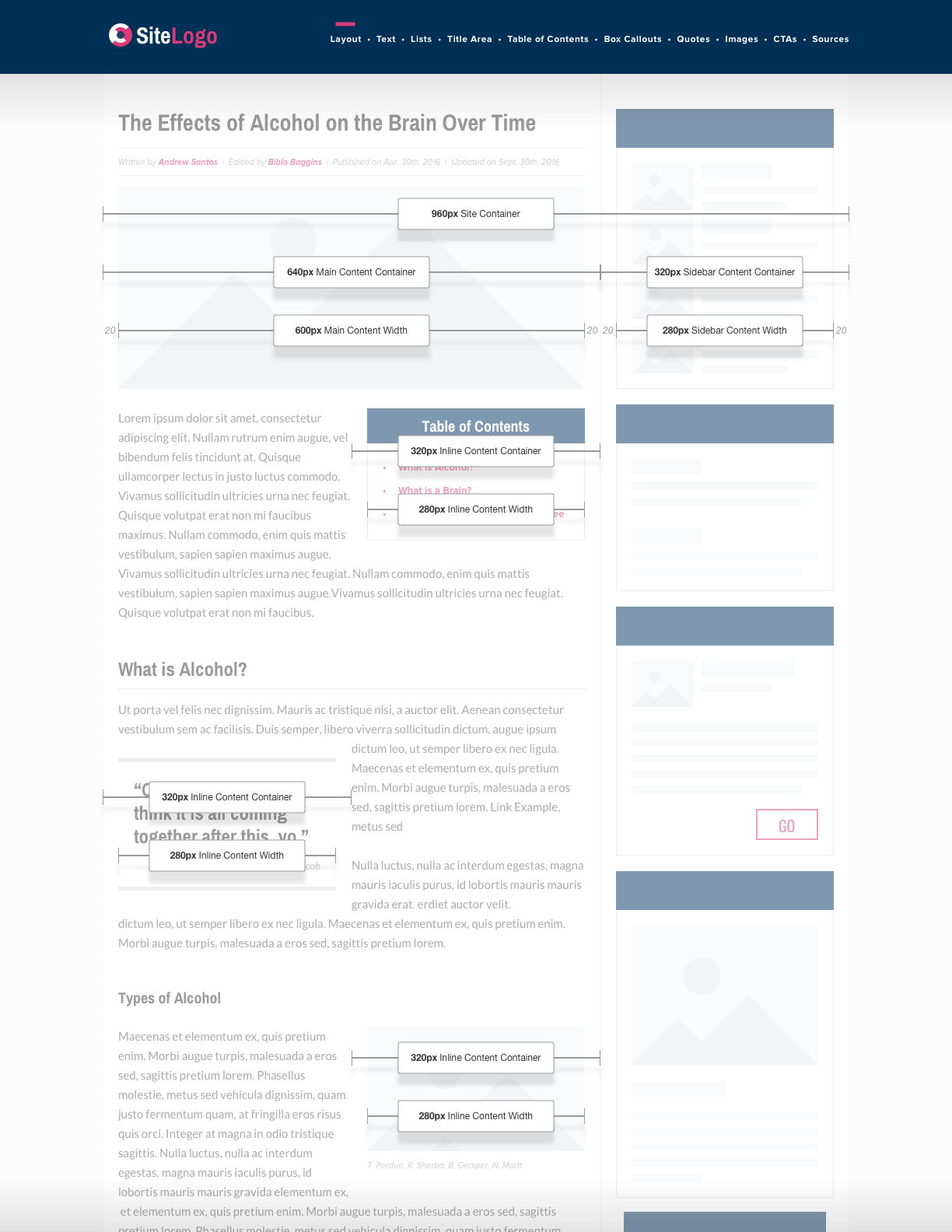
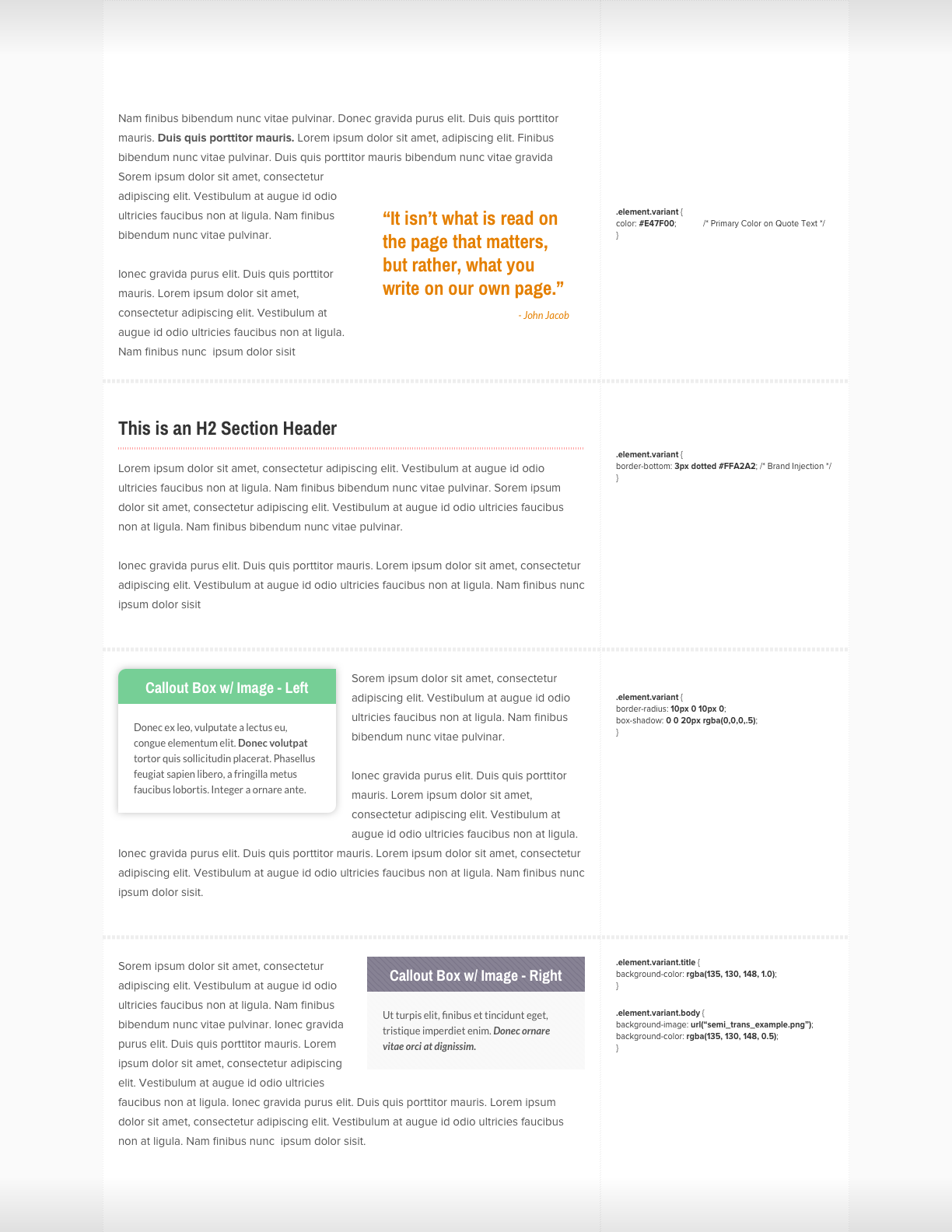
I decided to create some order where there was mostly chaos by choosing easy ways for both designer and developer alike to be able to make this ShortCode Bible system the ew normal, with things like generally using multiples of 5 for various steps in a progression. For instance,
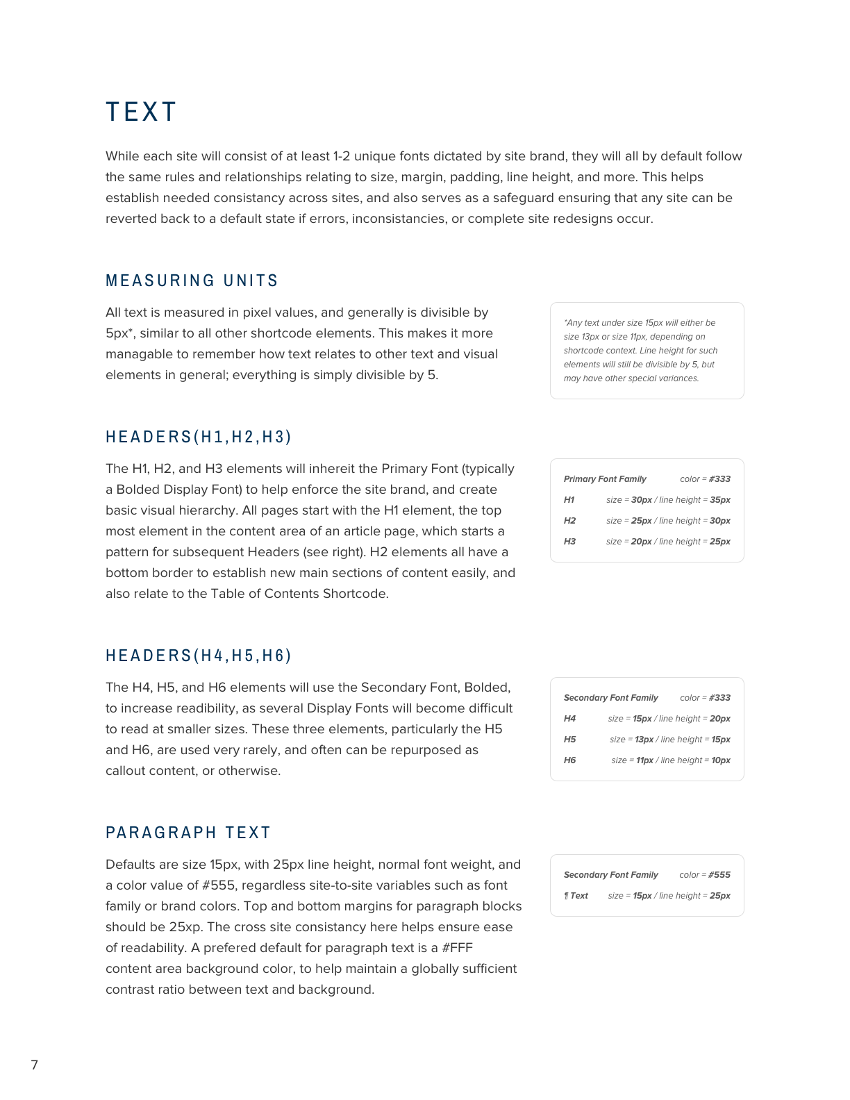
The size of the Header element line heights went from H1 at 35px to H2 at 30px, H3 at 25px, H4, at 20px, etc.
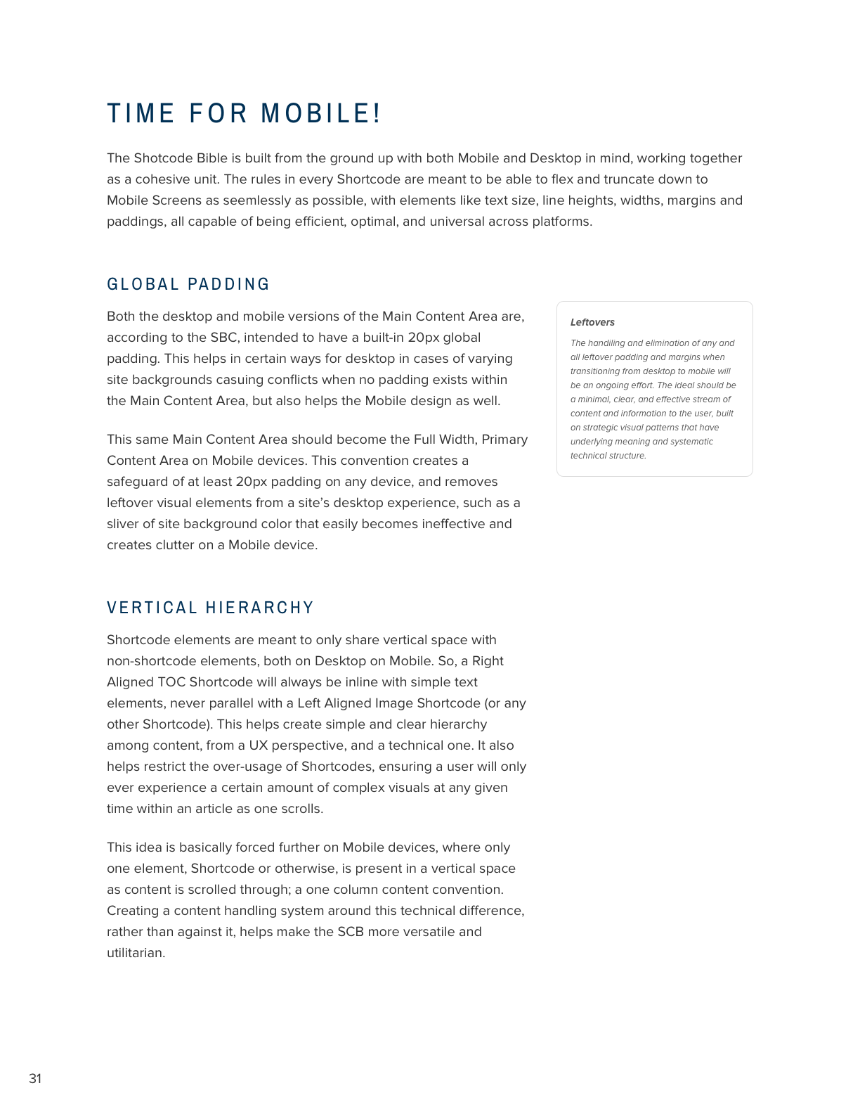
Elements like Headers would ALWAYS have 45px top padding, and Body Paragraphs would ALWAYS have 25px top padding.
Inline elements like images, callout boxes, or pull quote areas would almost always have 25px of top and bottom padding, and 0px - 20px of side padding depending on if it landed on the edge of a bounding box or was up against body text.
Most box elements containing other text and image would have 20px inner padding (sometimes 30px, for UI/UX related reasons).
Every single element would also have similarly planned out and repeatable design patterns, aimed at ease of use and memorability, as well as very specific visual significances, meant to help both train the content creator/publisher as well as the user/consumer into a streamlined experiential funnel or information presentation and consumption.
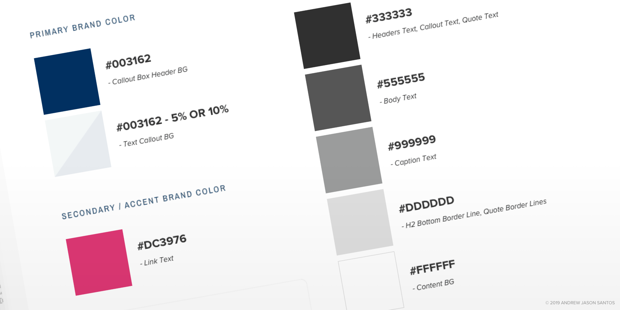

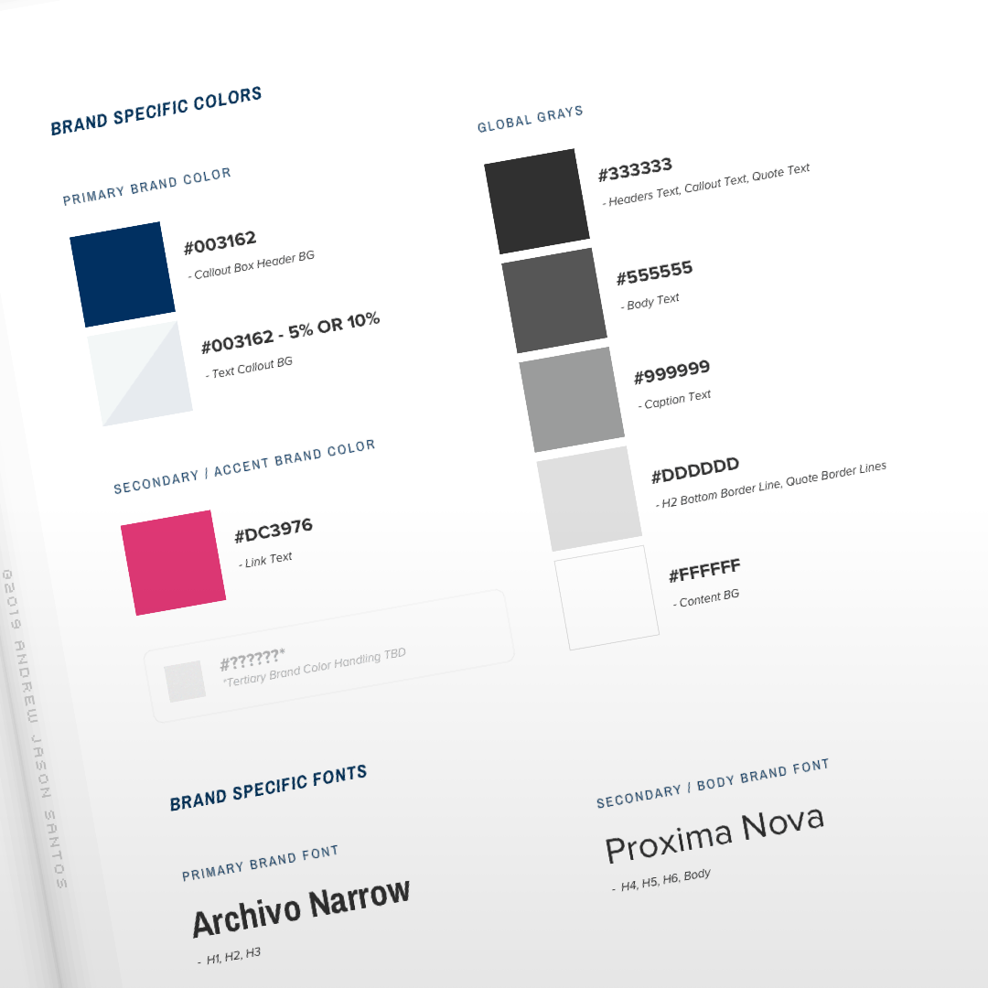
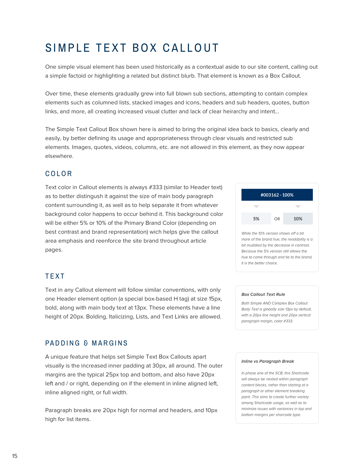
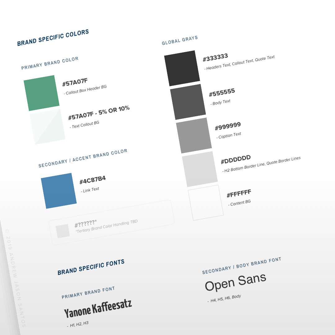
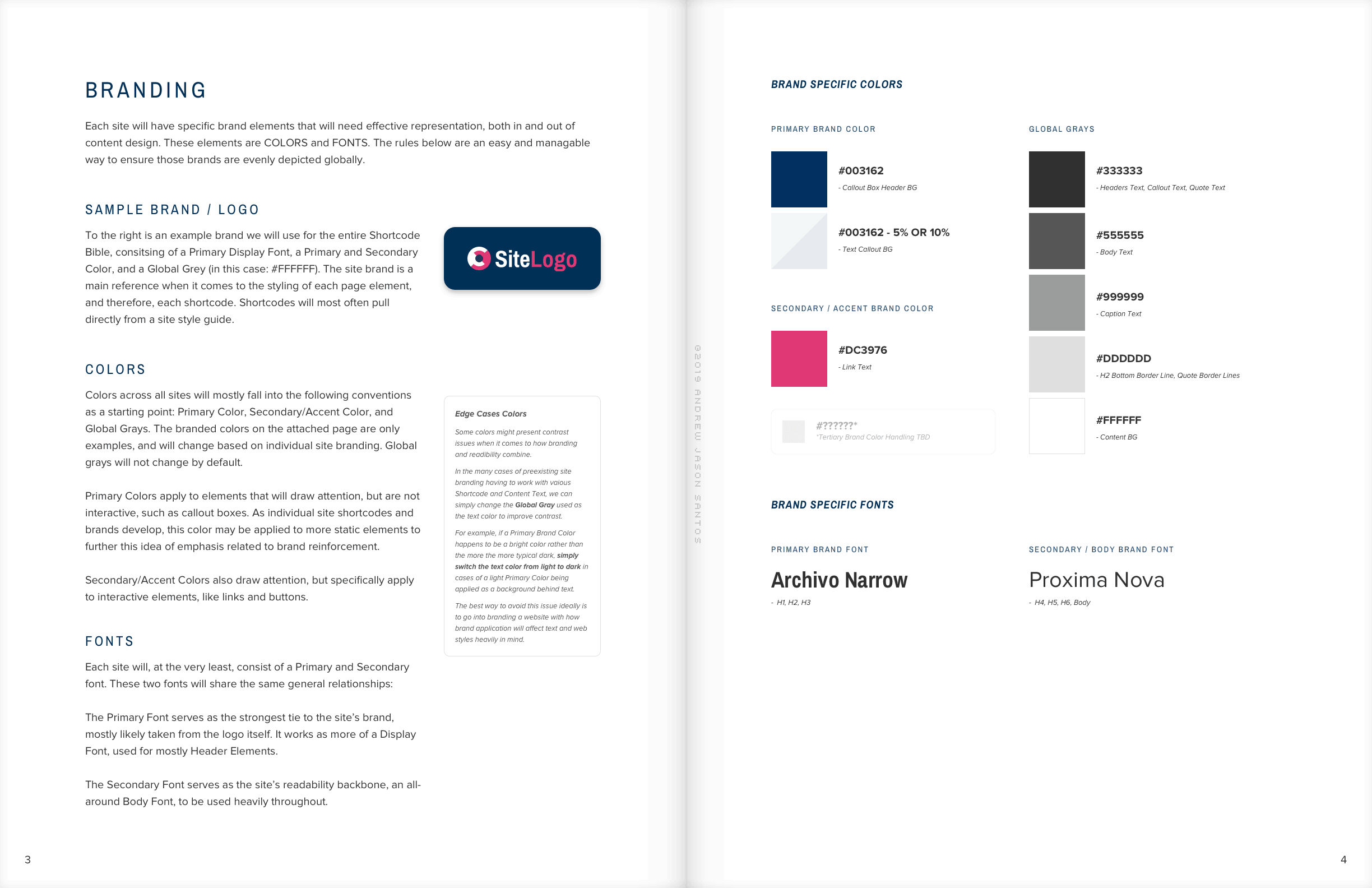
Color
When it comes to branding and color, I believe that simplicity is best. That is why I aimed to restrict color application to the ShortCode Bible down to one Primary Brand Color, and one Secondary Brand Color, which would, by design, be strategically applied to key elements throughout the content block, in ways that would tie directly to the brand of the site it is being applied to, subtly yet directly. For instance, the Primary Color in my example is aimed to be the more solid or foundational color in a brand, and will apply more to background elements, while the Secondary Color is most likely an accent, meant to standout and appear in the foreground. Some applications include:

Primary Color ApplicationCallout Box Background (at alpha 5-10%)
Callout Box Header Background
Static Elements

Secondary Color ApplicationLink Text
Button Color
Interactive Elements

Neutral Color ApplicationBody Text
Non-Branded Content
Universal Elements
Through standard repetition of these systems, the colors don’t just help visually reinforce a brand, but they also carry meaning and usage patterns for users to follow. If needed or desired, come color conventions can be changed or added to, but those patterns, too, would be noted and planned to have proper meaning and strategy, case by case.

Text & Fonts
Text, like color, would need to be a fluid system, most of the time inheriting whichever fonts were used on a host site the ShortCode Bible was applied to. Regardless, I still wanted to build a design theory and potential practice for sites that were yet to be built, or up for a redesign. I similarly took the Primary and Secondary structural approach with text, with Primary text using a more display, bold font typically, used for Headers, Titles, Quotes, and other standout elements, while then using a more subdued but high readable and versatile font family for the Secondary text, used for Body Paragraphs, Captions, and basically everything else.


For the guide’s demonstration purposes, I choose the bold and tall “Archivo Narrow” as the Primary Font, in that it works better for Display and Heading elements, but not so much for larger blocks of text, getting more illegible at smaller sizes. This is the kind of font that typically helps create Brand recognition on sites, being slightly more unique than other typical web fonts, but also works well as a Primary Font choice from a practical sense in that it is Narrow and takes up less horizontal space, coming in handy for long lines of text.
The Secondary Font I chose was Proxima Nova, a modern, sans serif font that has good readability at both large and small sizes, and comes equipped with a number of style variants, from Light to Black weights. These qualities make it an ideal candidate for large amount of content text, which all of the sites typically housed and needed help in dealing with, in order to give the user the best content consumption experience, without overwhelming them with walls of hard to read, ill-formatted text.
Content Building Blocks
The ShortCode Bible is designed around the idea of a system of building block content elements, which can all interlock and stack in various arrangements and configurations. The rules that govern the blocks themselves, as well as how they intermingle, are aimed to be simple, elegant, and versatile. The system itself is meant to be used by not only experienced designers, but developers, content writers, and junior production artists alike, so having visual content design elements act as stable storytelling lego pieces goes a long way; every piece has unique properties, but can only be used and fit in a predetermined number of ways. This method of global configuration rules also helps the overall system management of not just on but a series of web properties, making content as accessible and consumable as possible.
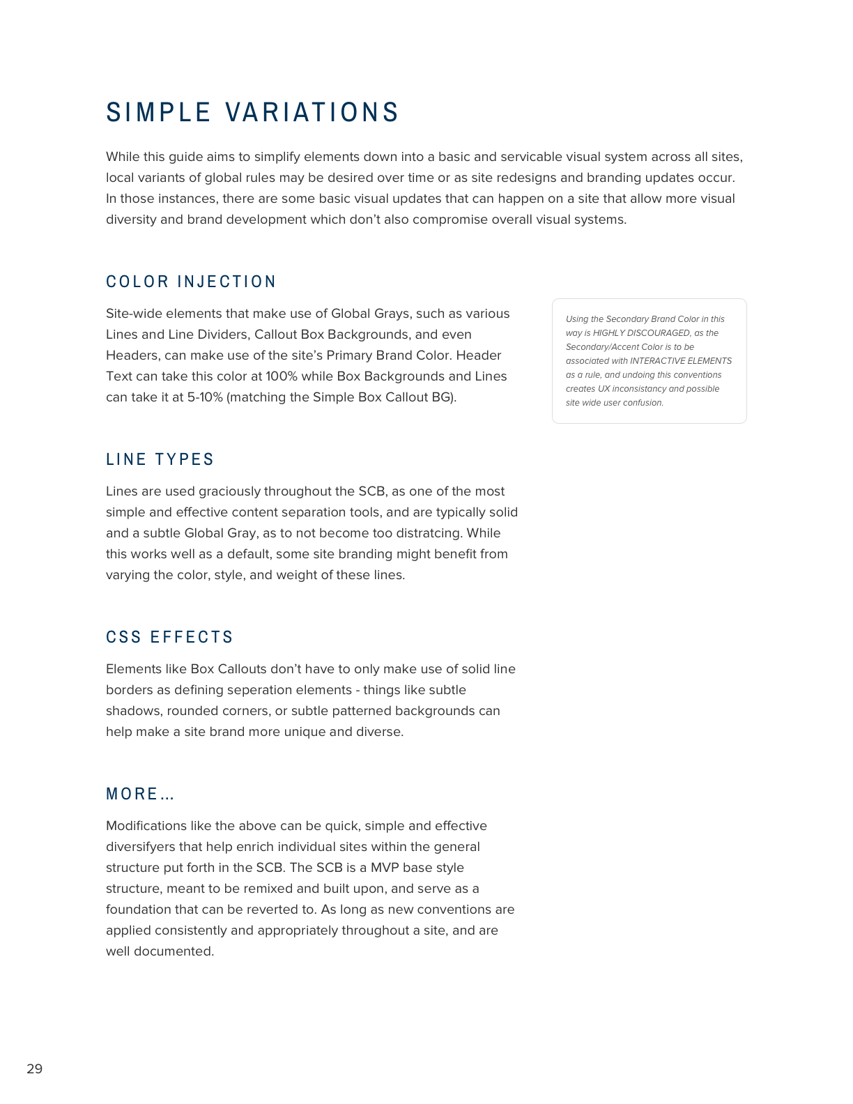
Variation
With the rigidness of the rules sets contained within the building block methodology, the ShortCode Bible also provides supplementary flex points aimed at system diversity and variability.
Every system within the ShortCode Bible can be altered from its base, as deemed necessary on a case by case basis, per site, per element. If a site aims to have overall more ample text line heights and increased margins and padding, perhaps to align with a brand that carries themes of space, independence, and room to breath, than that is perfectly fine, as long as the variations are well planned, documented, and have their own new systematic visual harmony devised.
At any point, these values can be reset to the default and content won’t suffer as far as basic presentation goes; the only thing lost may be whatever unique visual personality deviations from the baseline had been achieved through experimentation. This variability also aids in optimization and A/B testing scenarios, providing a baseline in which tests can be measured.

Implementation
The guide can (and has been) applied to any site in the company portfolio, as long as it is based on and built around basic web content (so things like a forum, directory page, store front, etc. would need their own ShortCode Bible Extensions™). During my time at this organization, I was involved with the bulk of one ShortCode Bible implementation, for which I created a separate, site specific branded guise for the development and design teams to follow (just to make it that much easier, though not a requirement). This process was relatively simple, and mostly replaced brand specific colors and fonts, with a few other site specific modifications here and there. It was a great proof of concept project for the guide and the development, design, and production process, and proved to be effective, efficient, scalable, and overall very successful.
…And Beyond!
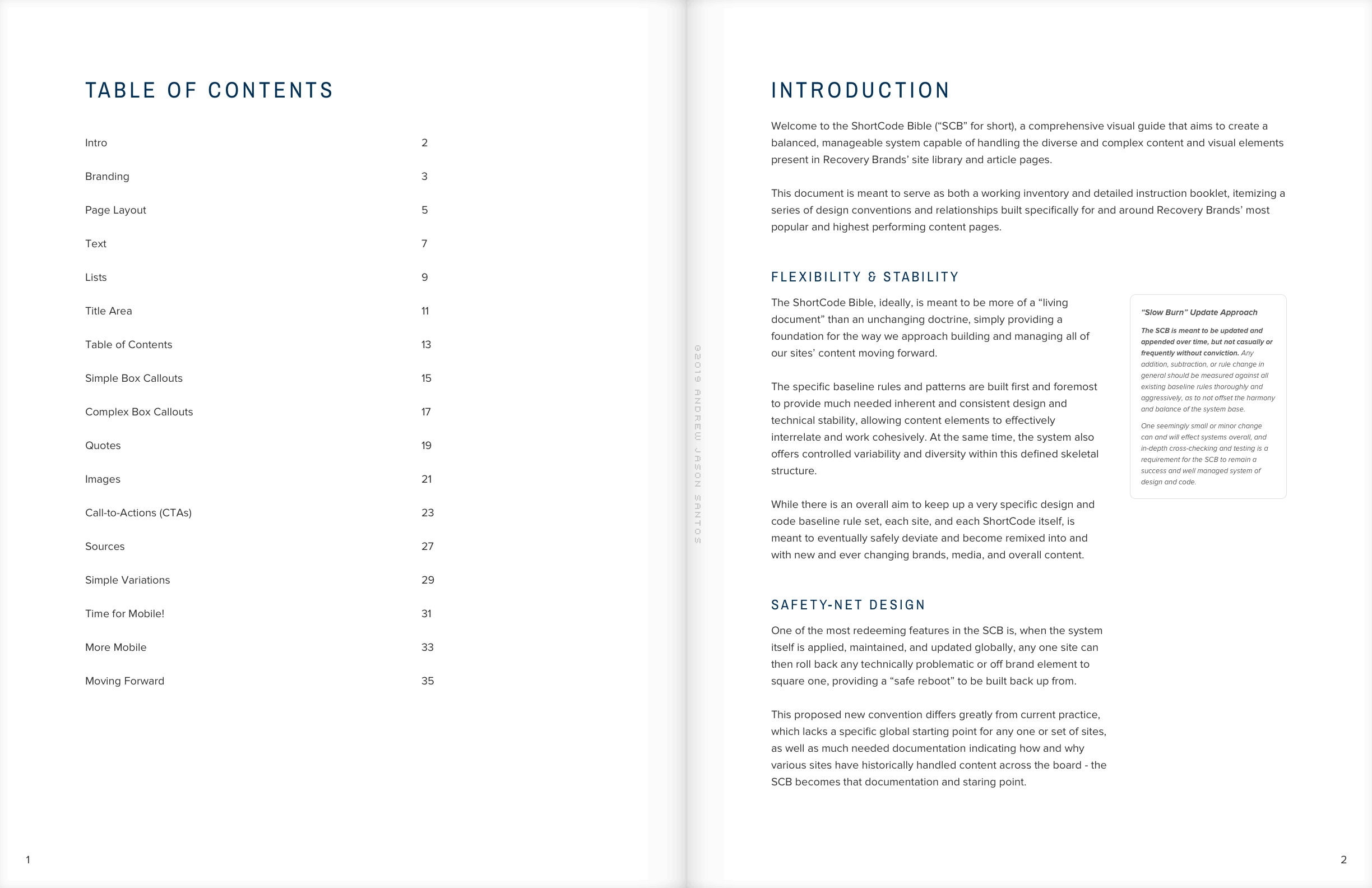
Rather than go into to much further detail here, I have provided the ShortCode Bible guide in full within this very deep dive (top of page for pages, bottom of page for spreads). The guide goes much deeper into the specific rule sets for each and every available elements to appear on any page of web content to be built out ( there is even CSS code included in the margins). Building out design systems and philosophies is something I enjoy very much, and would like to do again and again in the future, so even though these types of guides are a bit arduous and seemingly tedious to make, I see them as a necessary, sometimes even righteous way of bringing content together, aligning several different teams and users together along the way.

Full ShortCode Bible Guidebook Spreads
Below is the full 30+ page guidebook I fully wrote, designed, and assembled, covering a full UI/UX design system to be applied to numerous websites, with detailed theoretical and technical descriptions, as well as even HTML and CSS code examples and notes found in the margins adjacent to various visual element depictions. This guide is meant to be definitive, a tool for anyone ranging from Content Writer, Graphic Designer, Production Artist, or Web Developer.


Succeses & Lessons
Success!
It worked! Meaning… it was able to be implemented and used by many, and was deemed a great success, much easier to use and maintain than anything anyone had been forced to use and manage with the previously chaotic web frameworks.
It created design and brand harmony, tying several web properties under the same umbrella, and making content overall more digestible for users.
It streamlined production! Previously, production designers would hack and slash Wordpress behind the scenes, PER PAGE OF CONENT, all in unique, undocumented and mismanaged ways, creating endless design and technical debt. The ShortCode Bible eliminated bloat and saved time and money.
Lessons…
Would aim to have better data and research available upfront and throughout the process, as well as a way to track data after the system was implemented to help curate future changes and addition to the design kit/guide.
The project was always experimental and open-ended, so setting timelines would have helped moved things along (and actually be built and implemented for use by the Content, Design, and Development teams!!) as the project took over a year to complete, well after my portion was handed off to development.